Find beauty in everything.

Kaaps Met Djou

Steenberg Wine

See What They Hear

Picnic Cafe and Deli

Reignite Your Humanity

The Foundations of Parasitism

VGP Jobless Behaviour

Just Another Letter

The Hero's Voyage

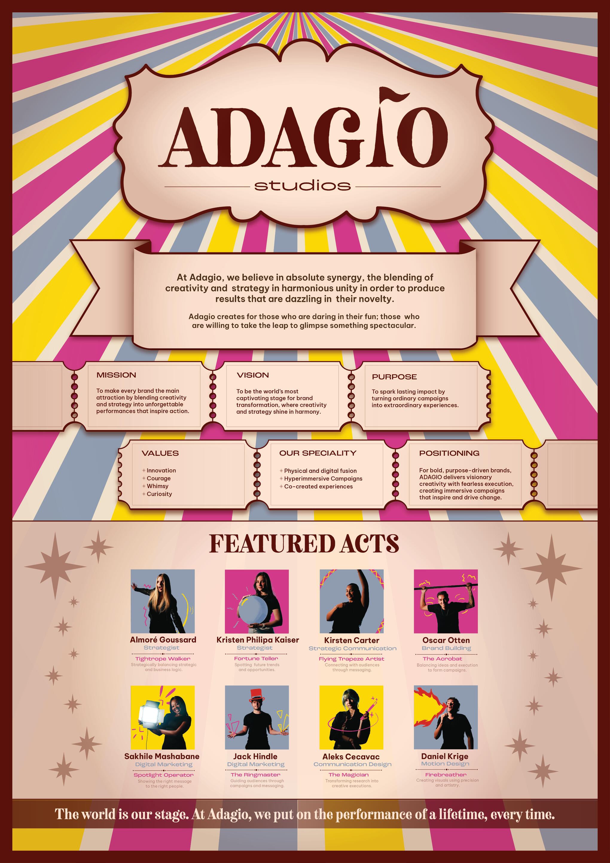
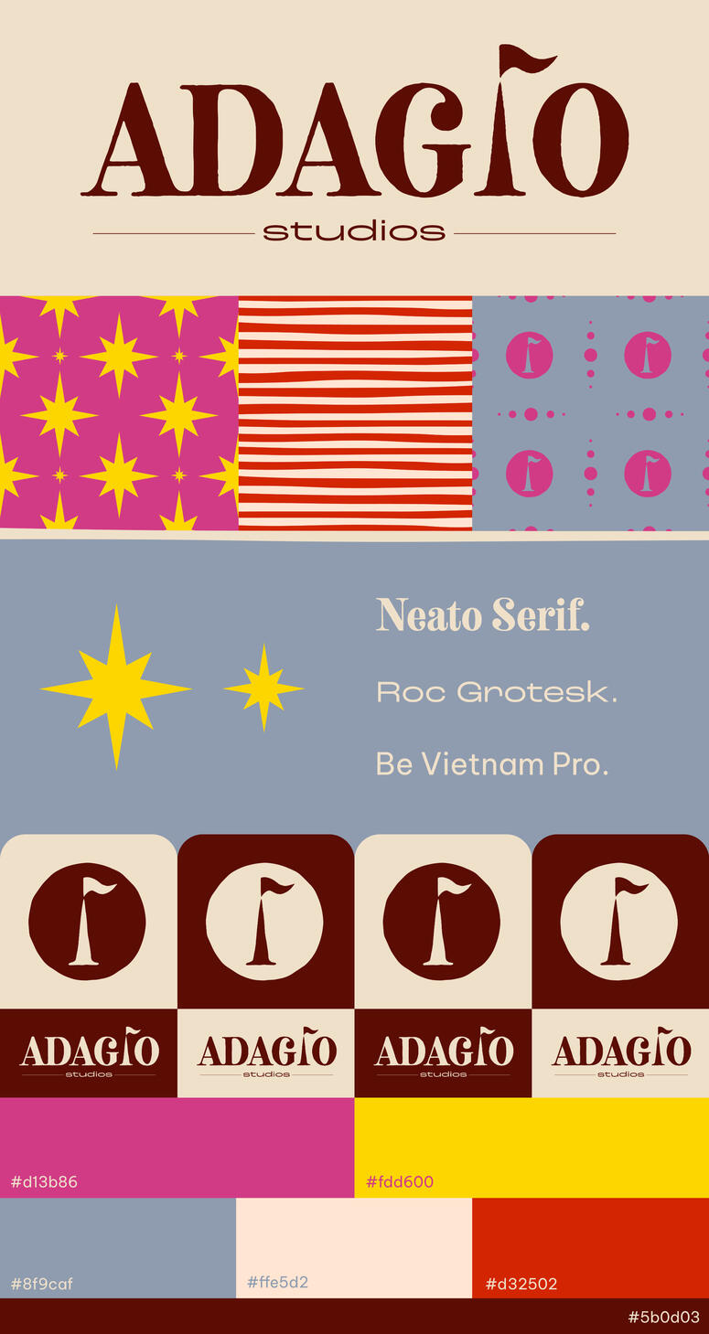
ADAGIO Brand ID


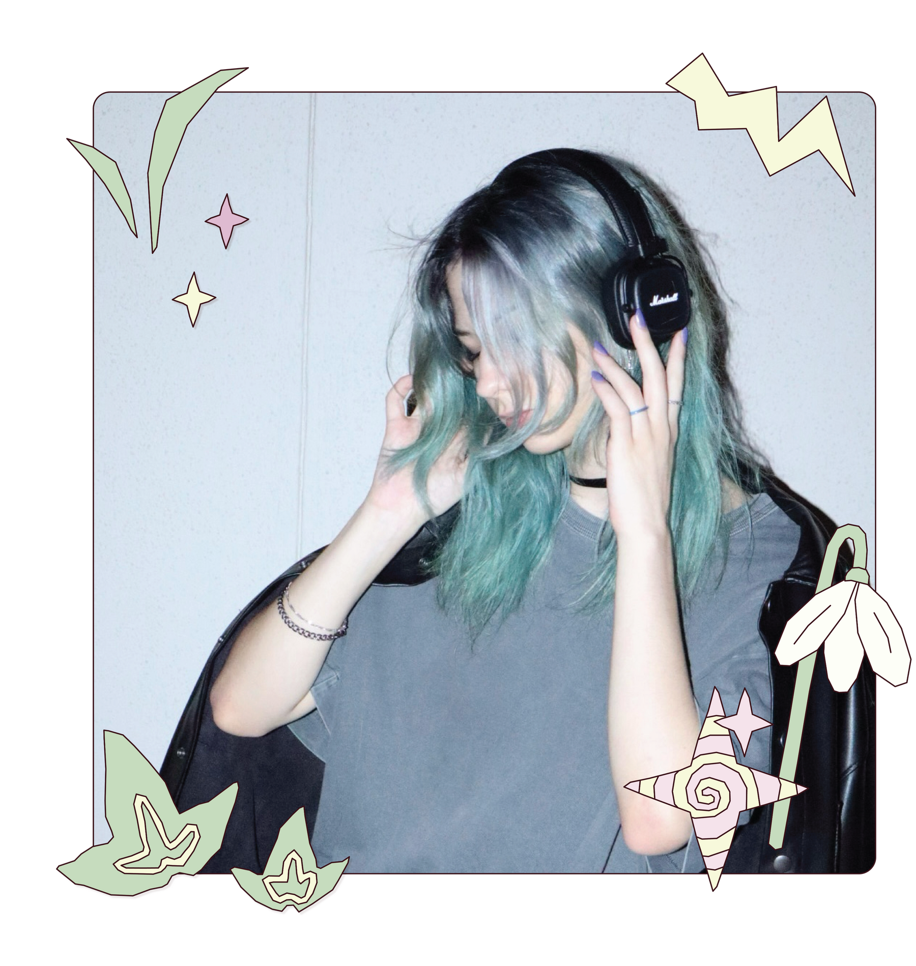
About The Person
I’m Aleks – a creative who strives to spark a butterfly effect of change through every design I share with the world.My work explores design at its core; the human connection that lies at the heart of all impactful design. I create with empathy and the aim to generate disruption, breathing new life into the design industry, and challenging old-set perspectives through each new project.Rooted in my life-long passion for fine arts, my designs aim to both challenge the status quo, and create a ripple in the fabric of modern societal thinking.
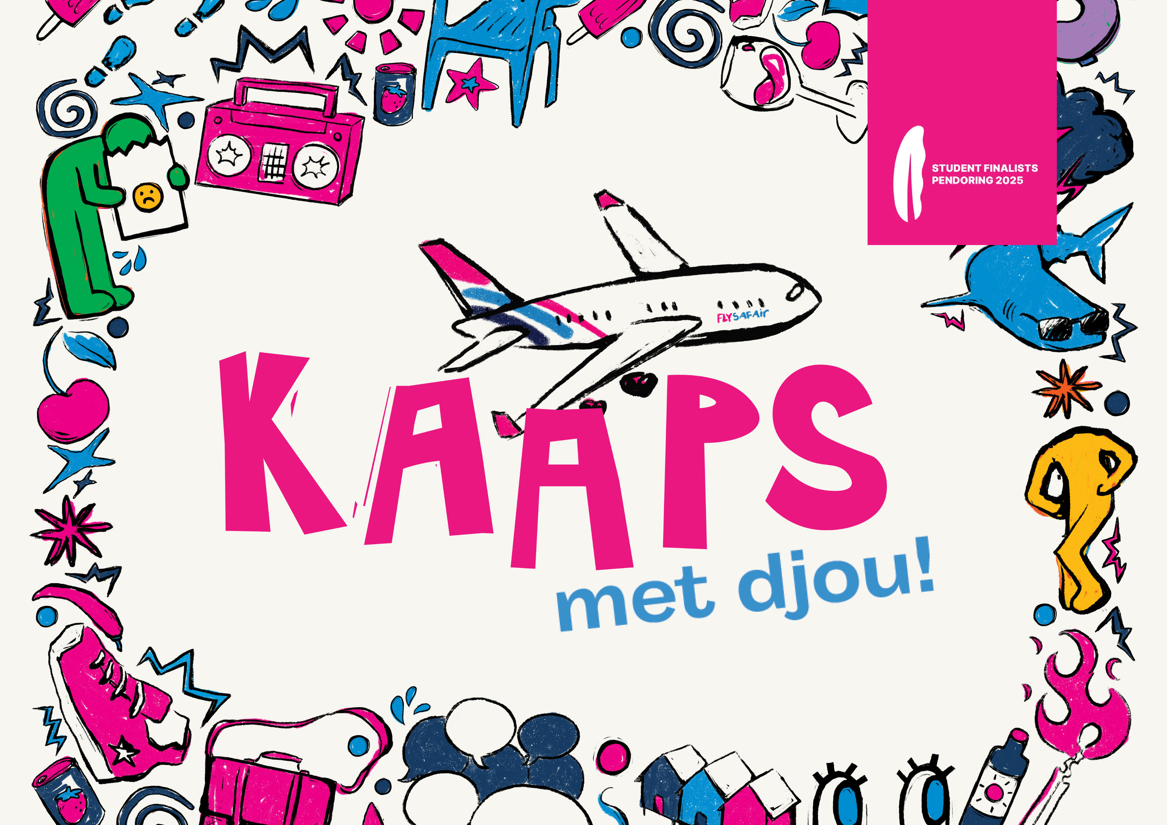
Kaaps Met Djou
In Cape Town, Kaaps speakers continue to fight for their language to be recognised for what it is: a real language. However, South Africans’
tendency to avoid topics related to our country’s history of struggle has led to stereotypes and misconceptions surrounding the Kaaps language
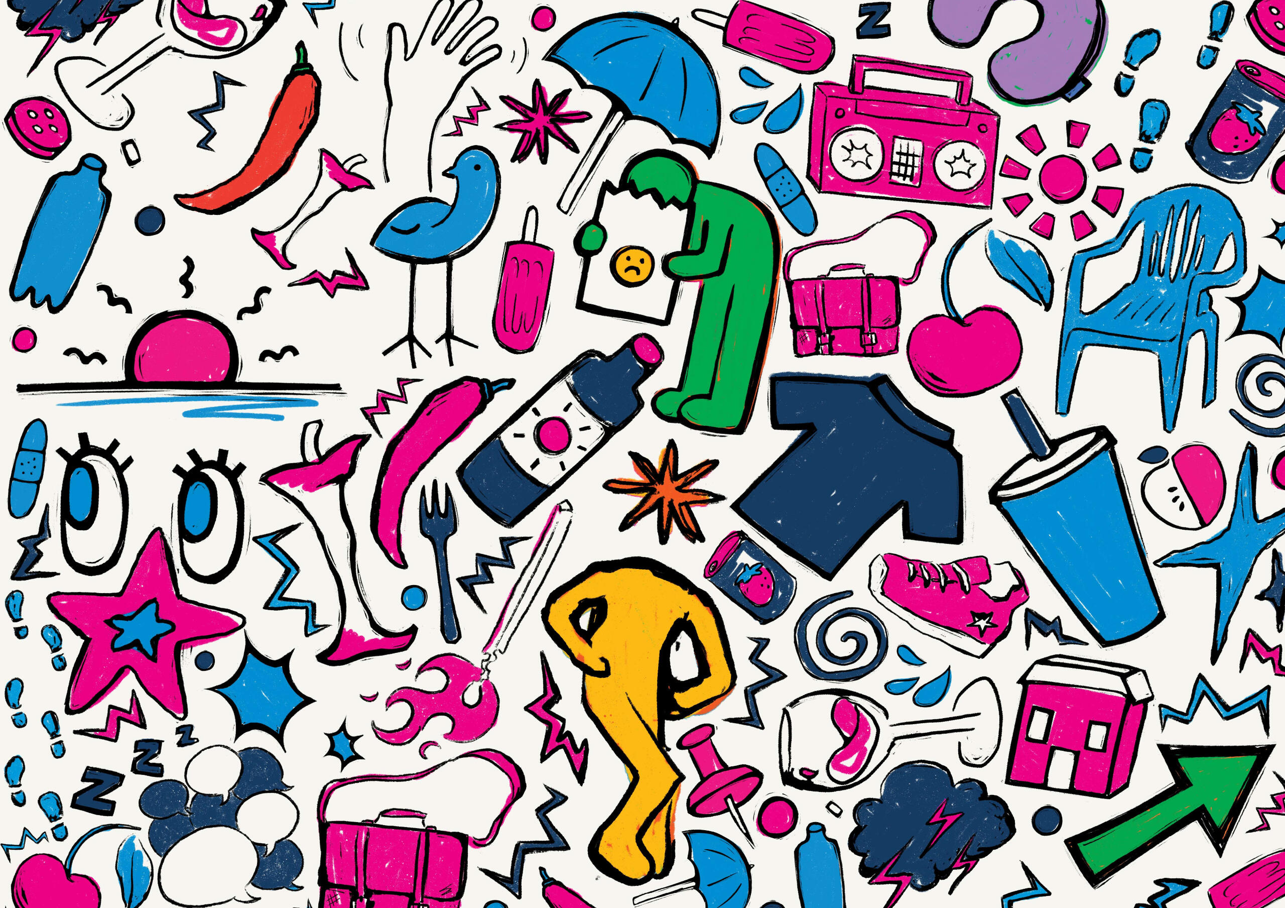
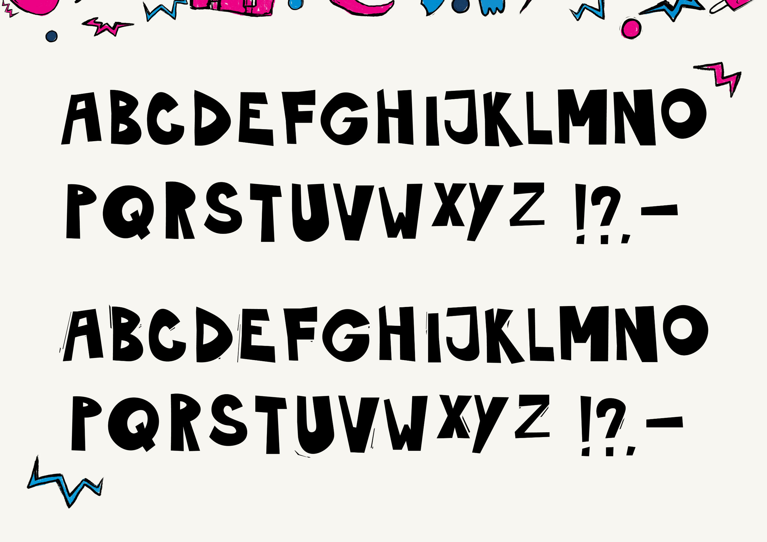
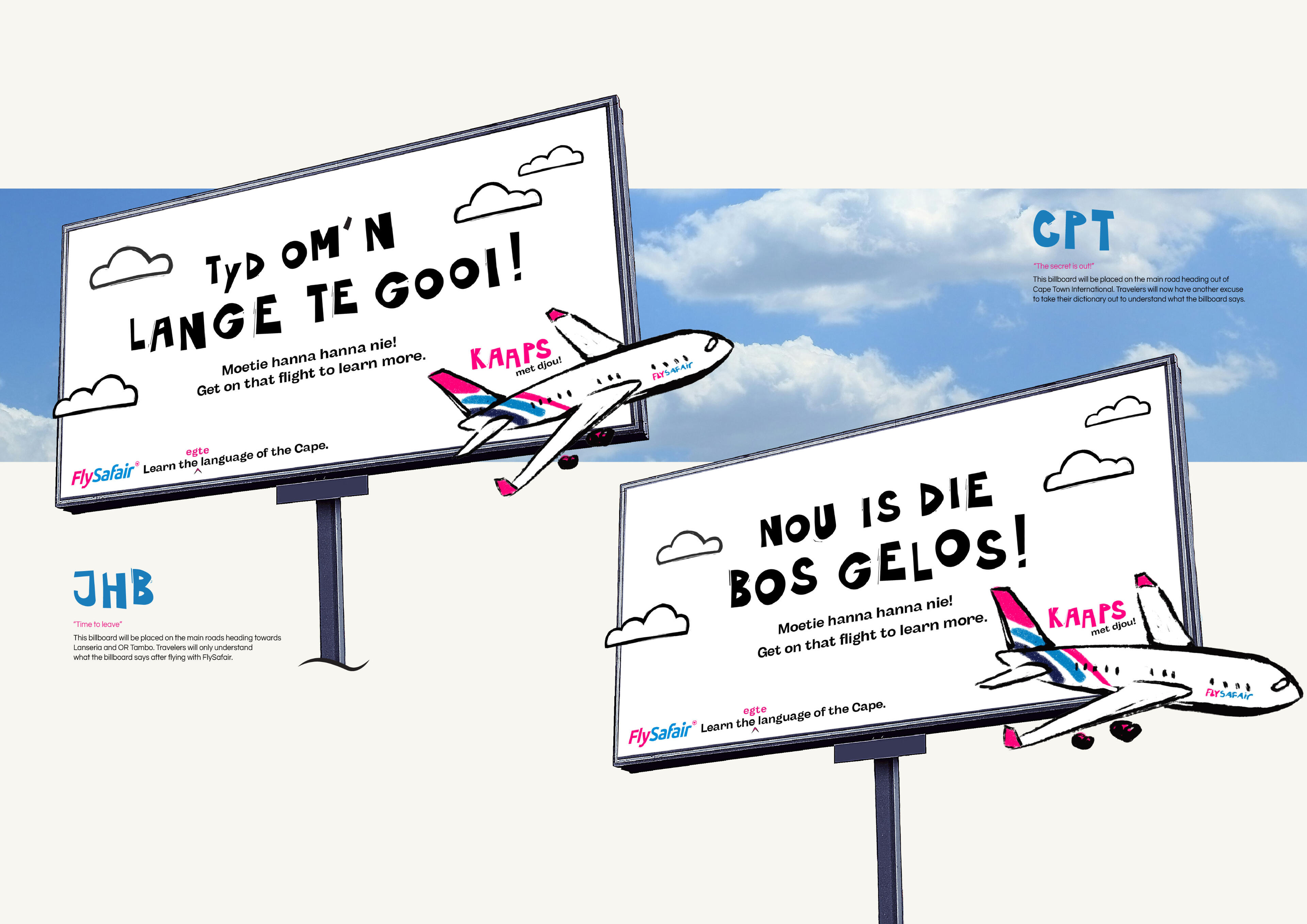
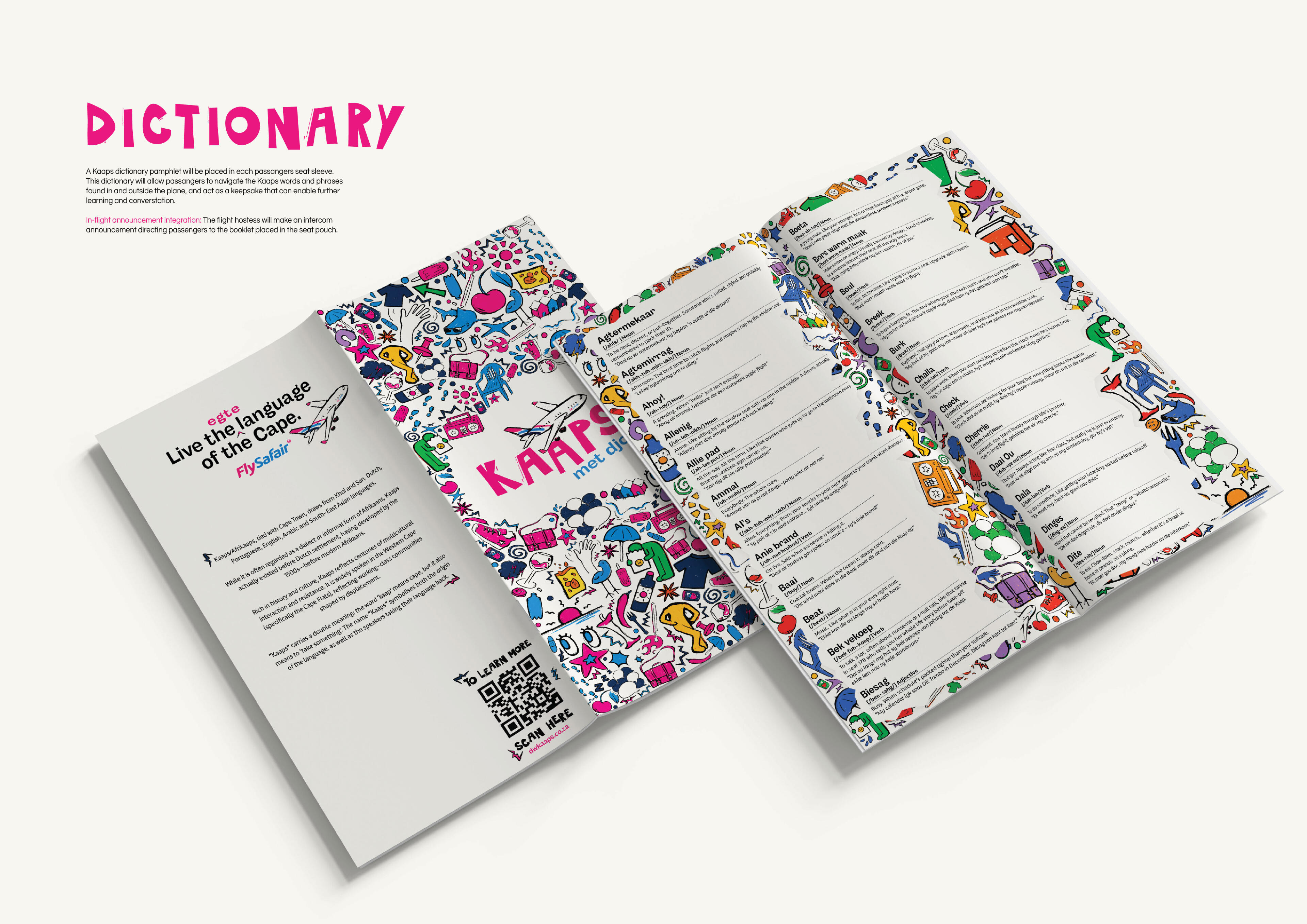
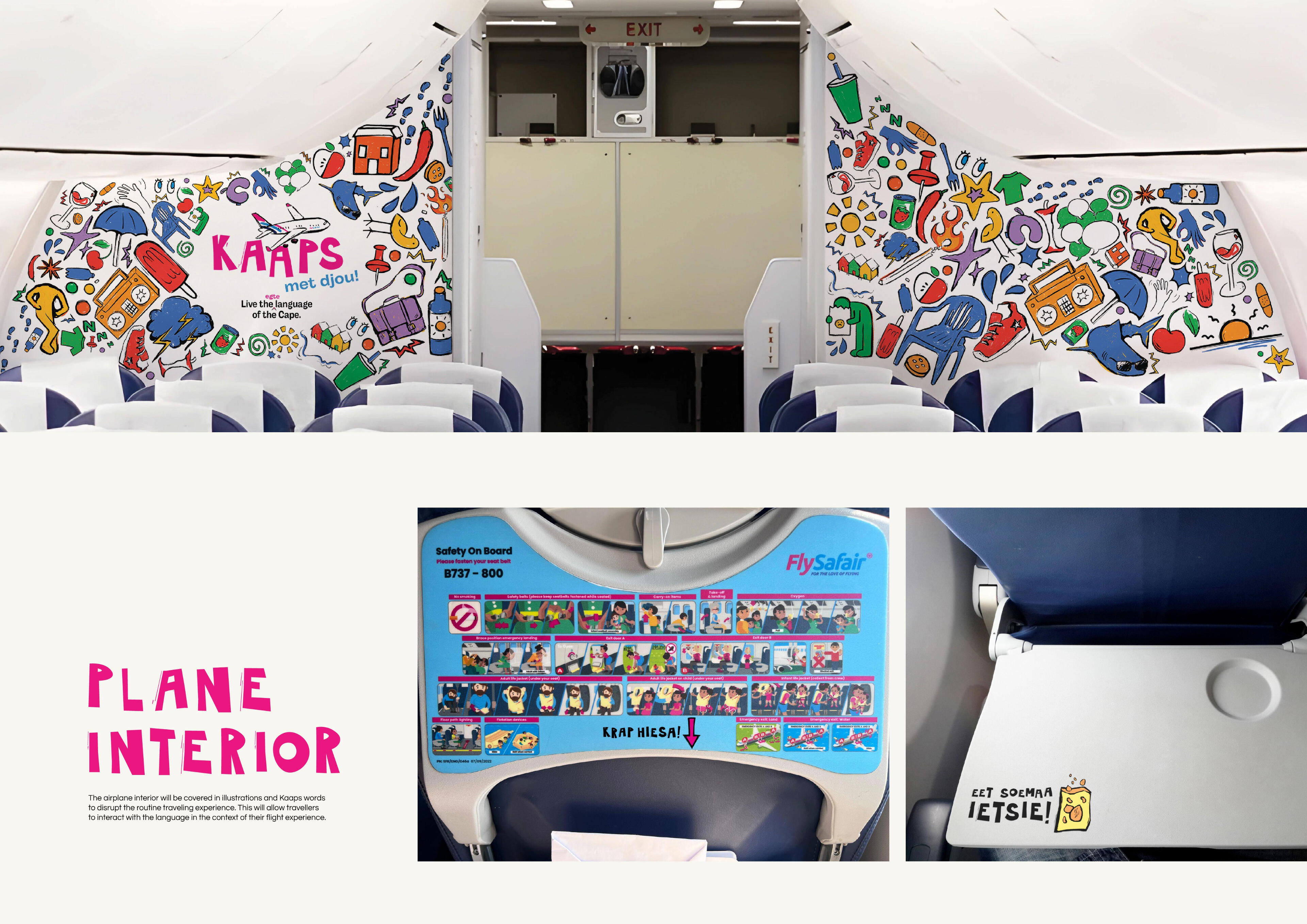
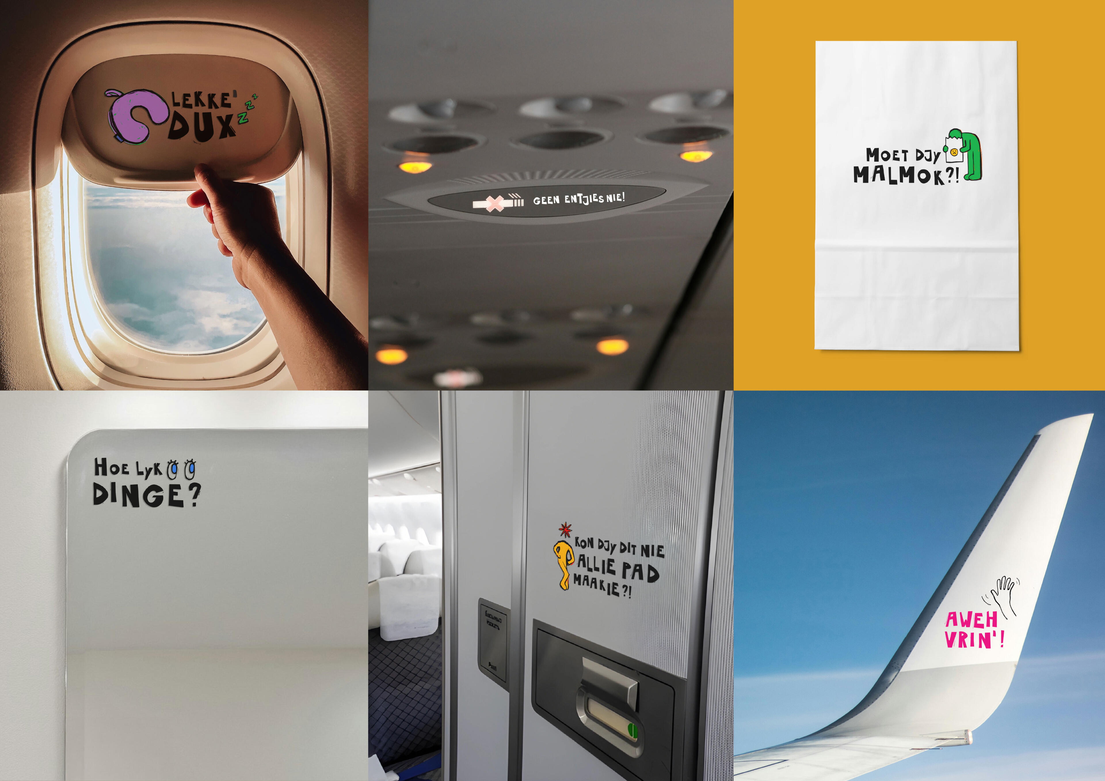
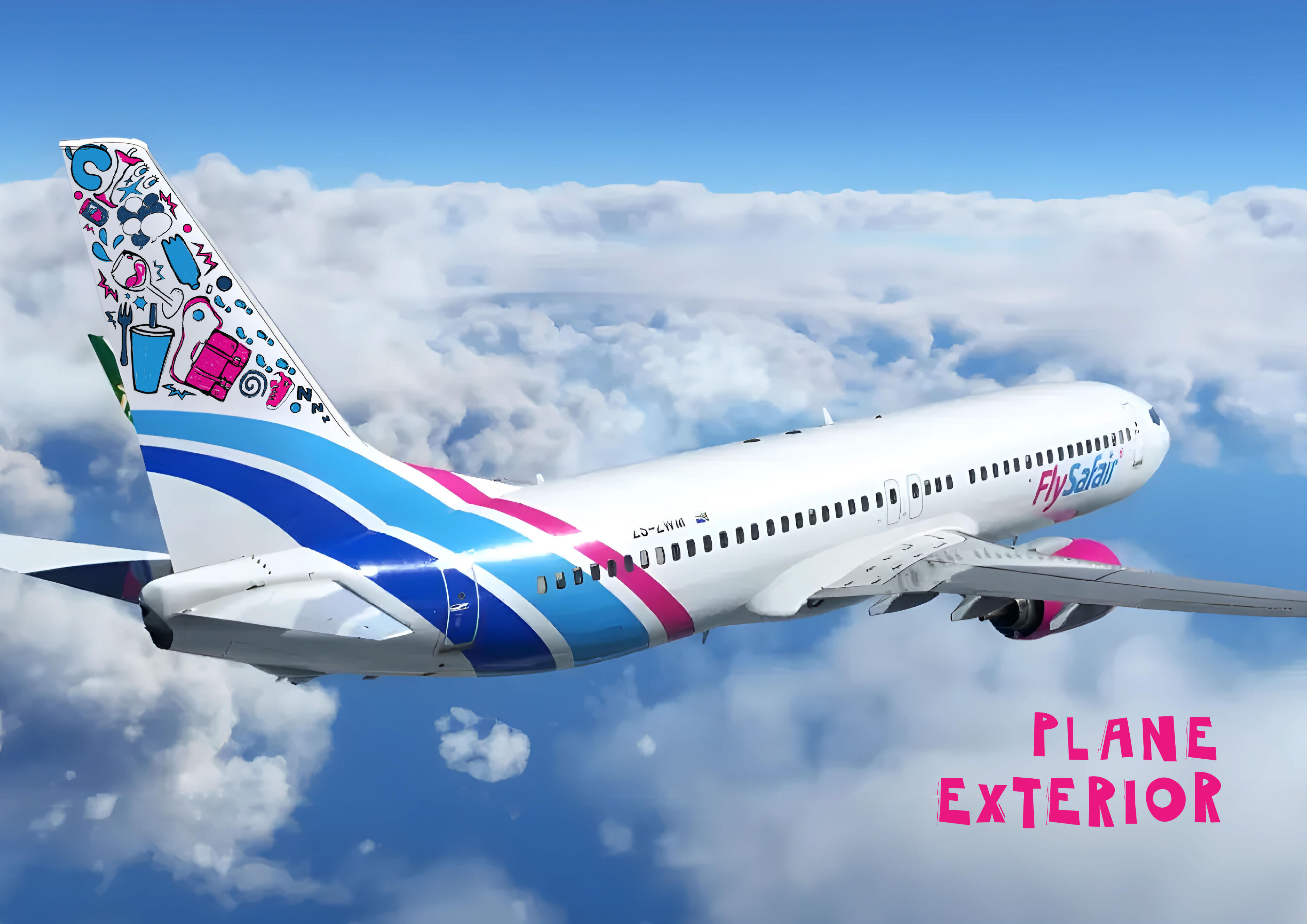
to become widespread.In collaboration with FlySafair, Kaaps met djou! aims to spark conversation surrounding Kaaps through immersing travellers within Kaaps throughout their travel experience. Beginning at billboards, continuing through the plane interior, up until departure from the airport, Kaaps met djou! saturates the travel experience with Kaaps.Every idiom, phrase, and message is a reminder that Kaaps isn’t just a language, it is a part of Cape Town identity, pride, and presence.Kaaps doesn’t sit quietly. It speaks up.
This project was created in collaboaration with
Emma Clough, Karli Henning, and Lara van Zyl
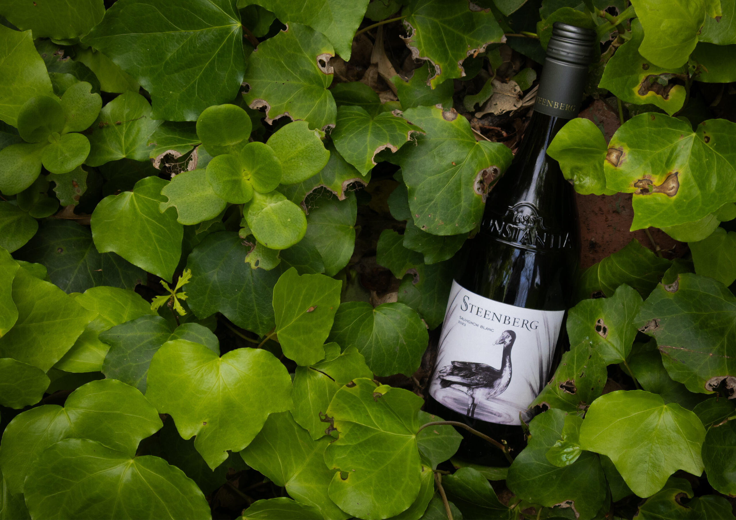
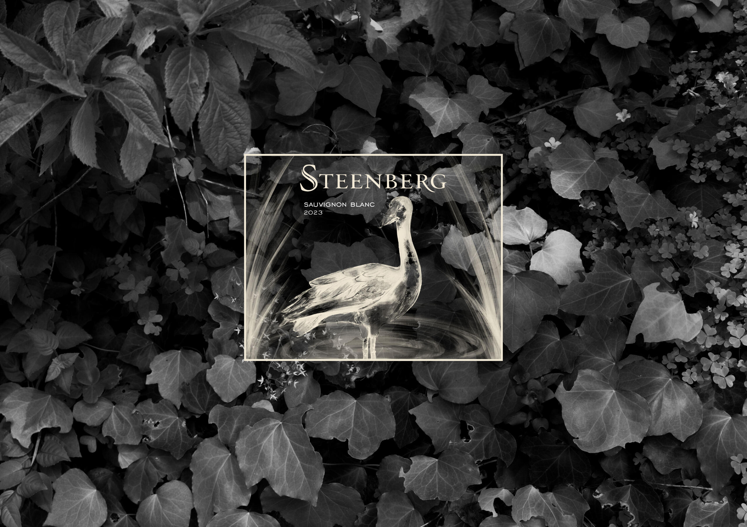
Steenberg Wine Label
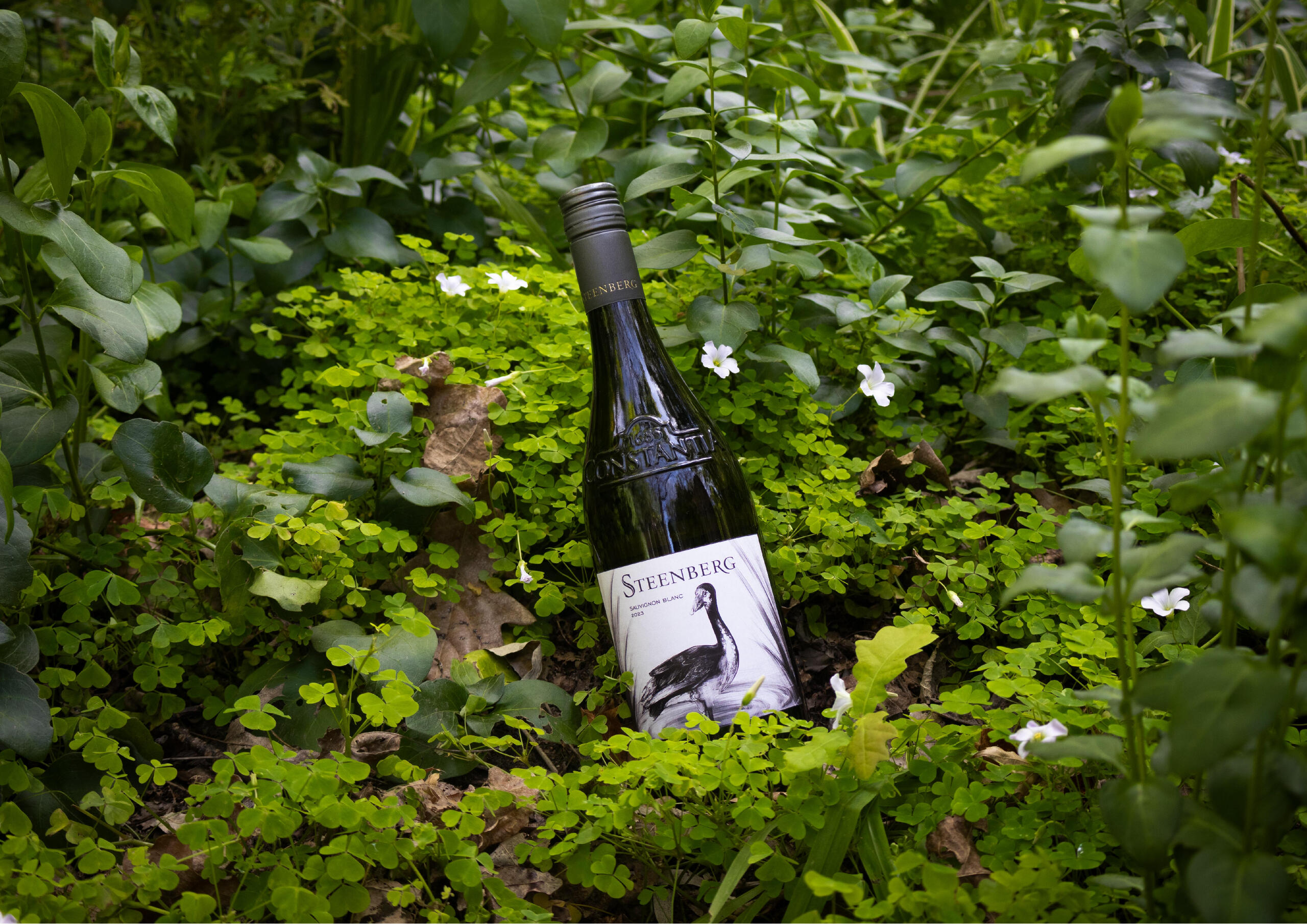
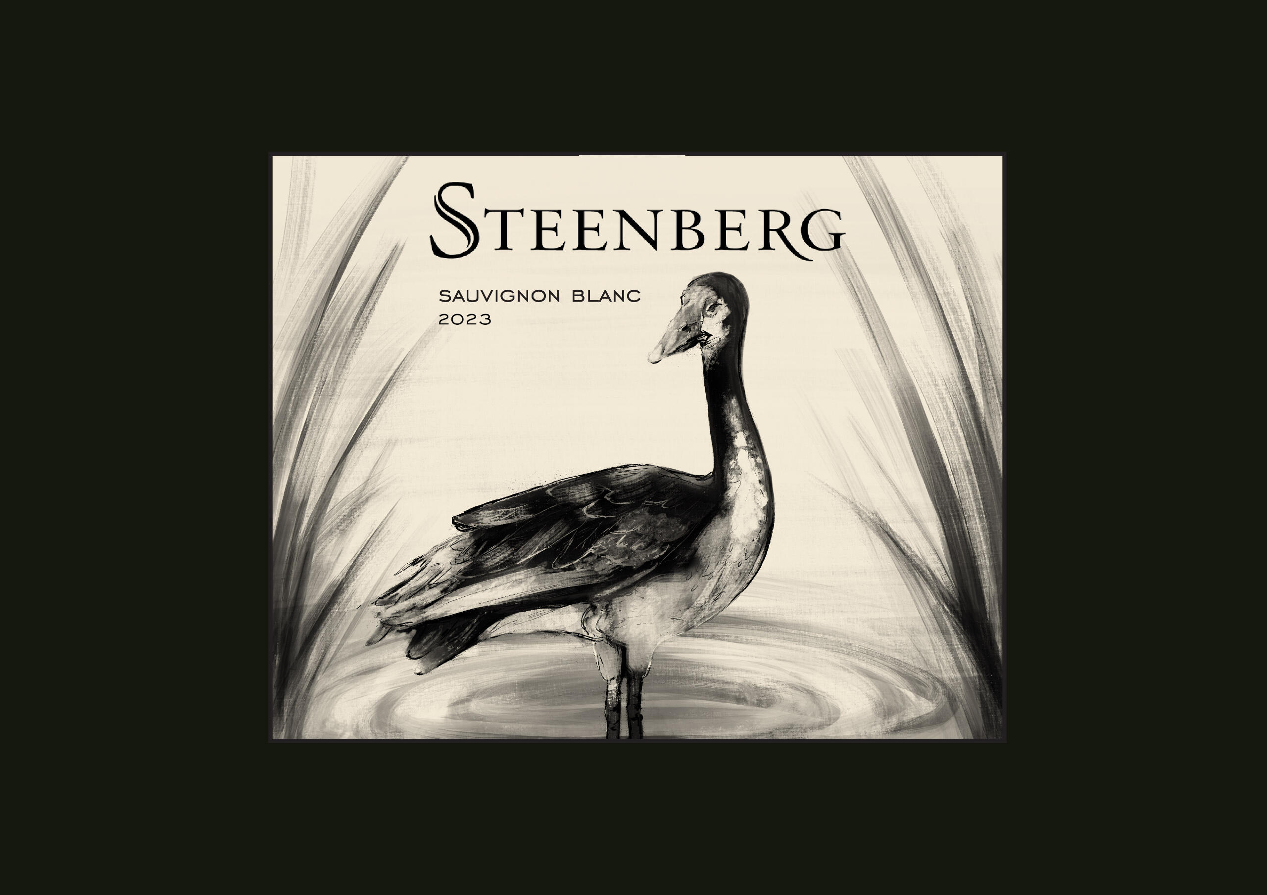
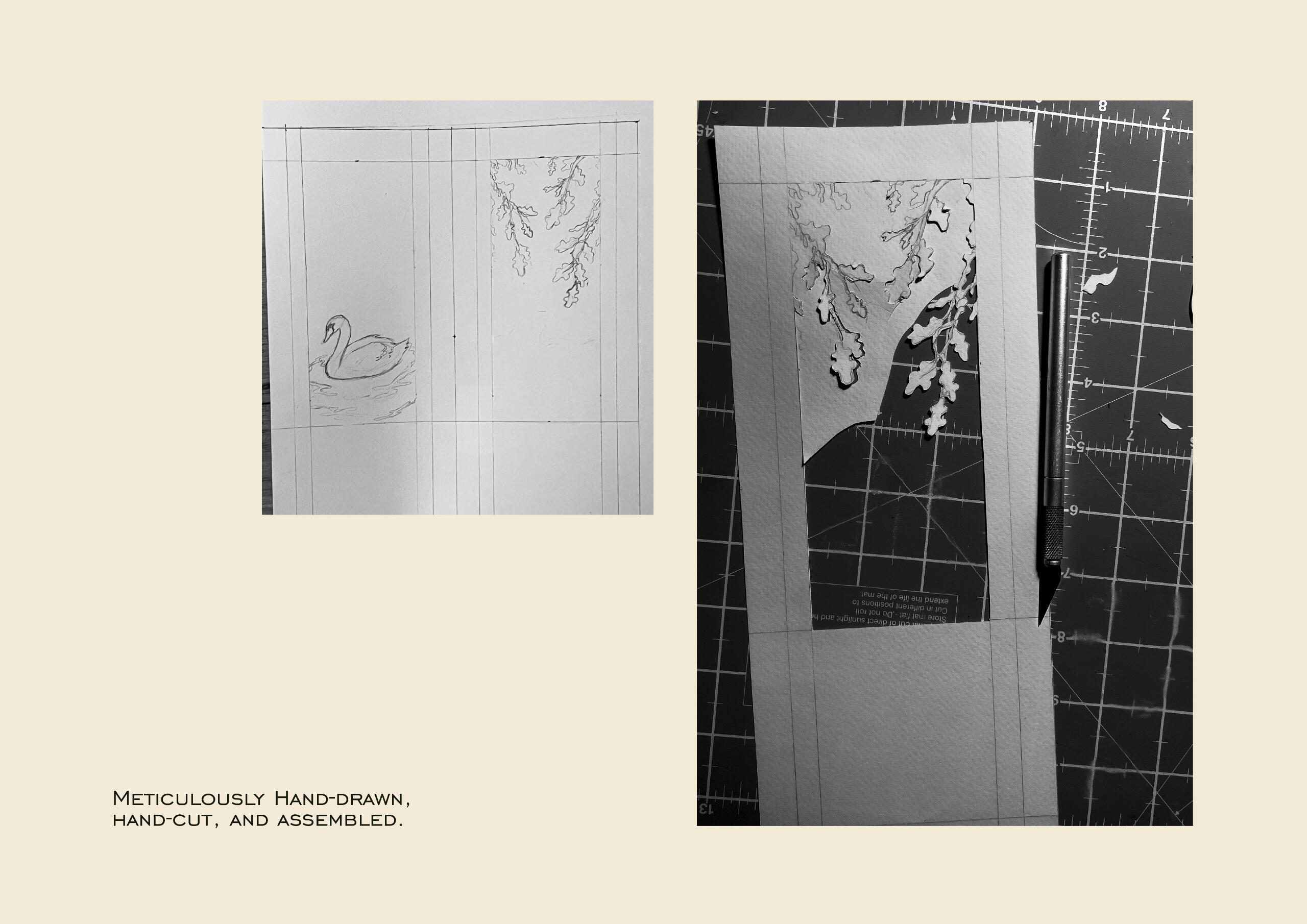
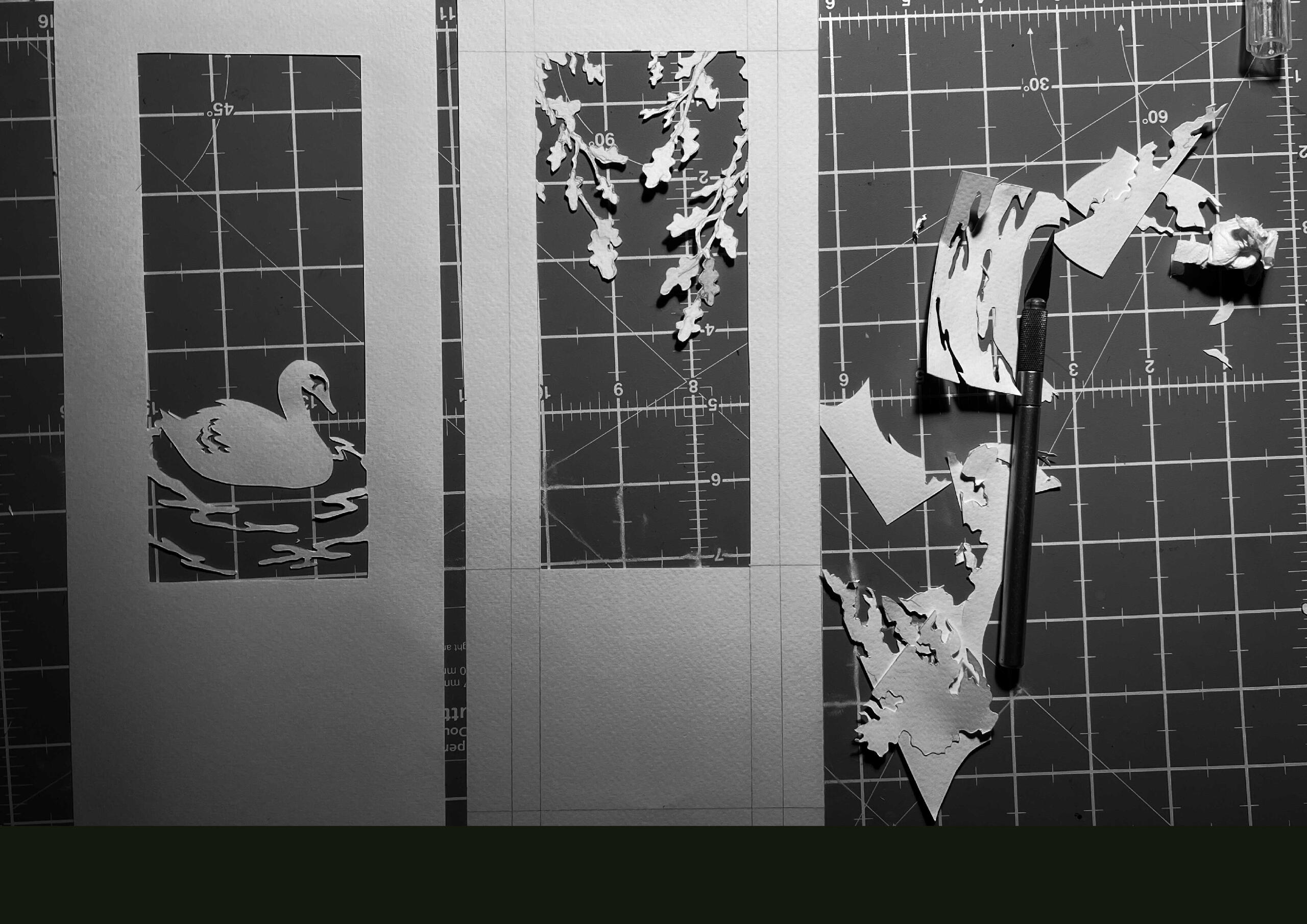
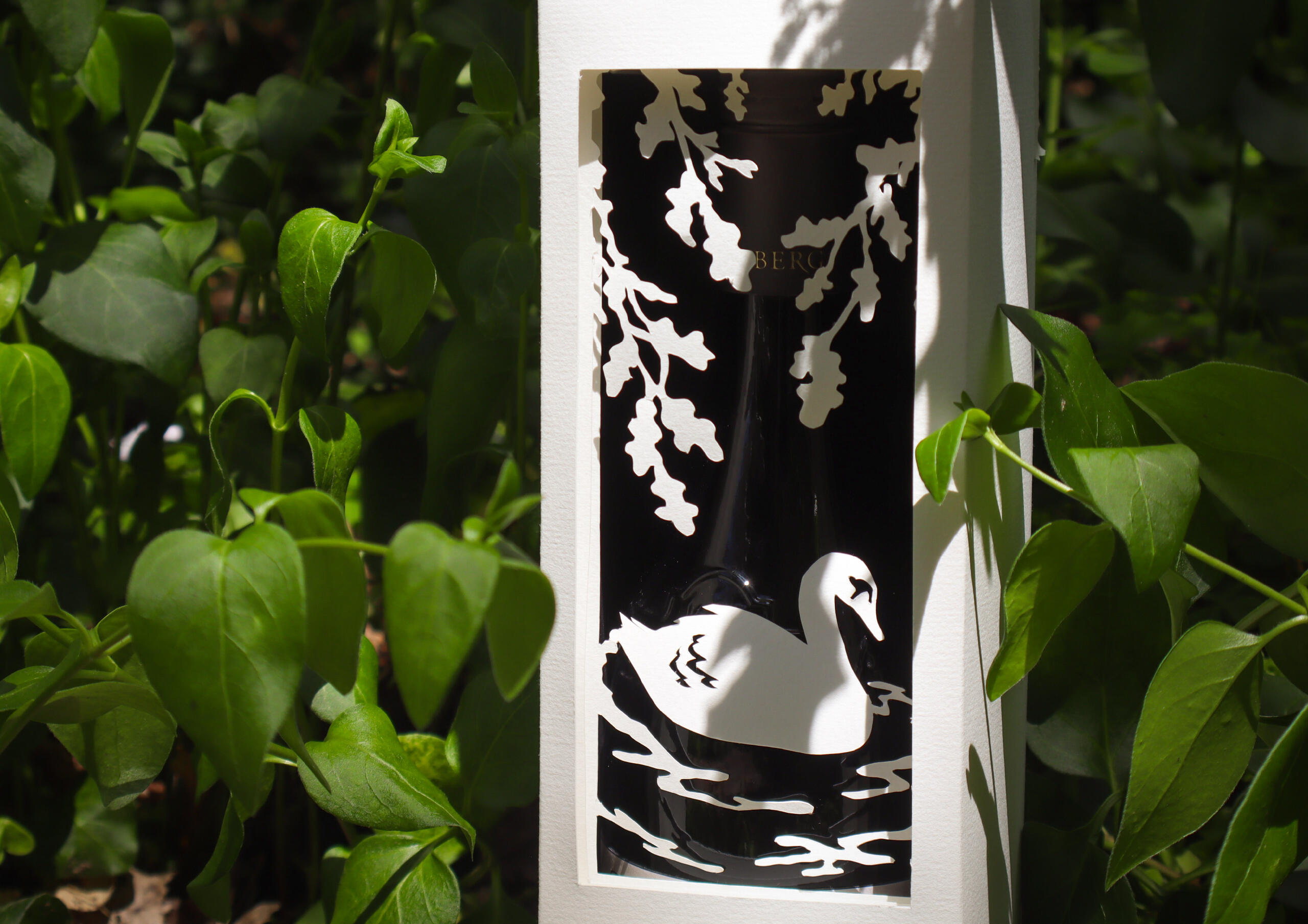
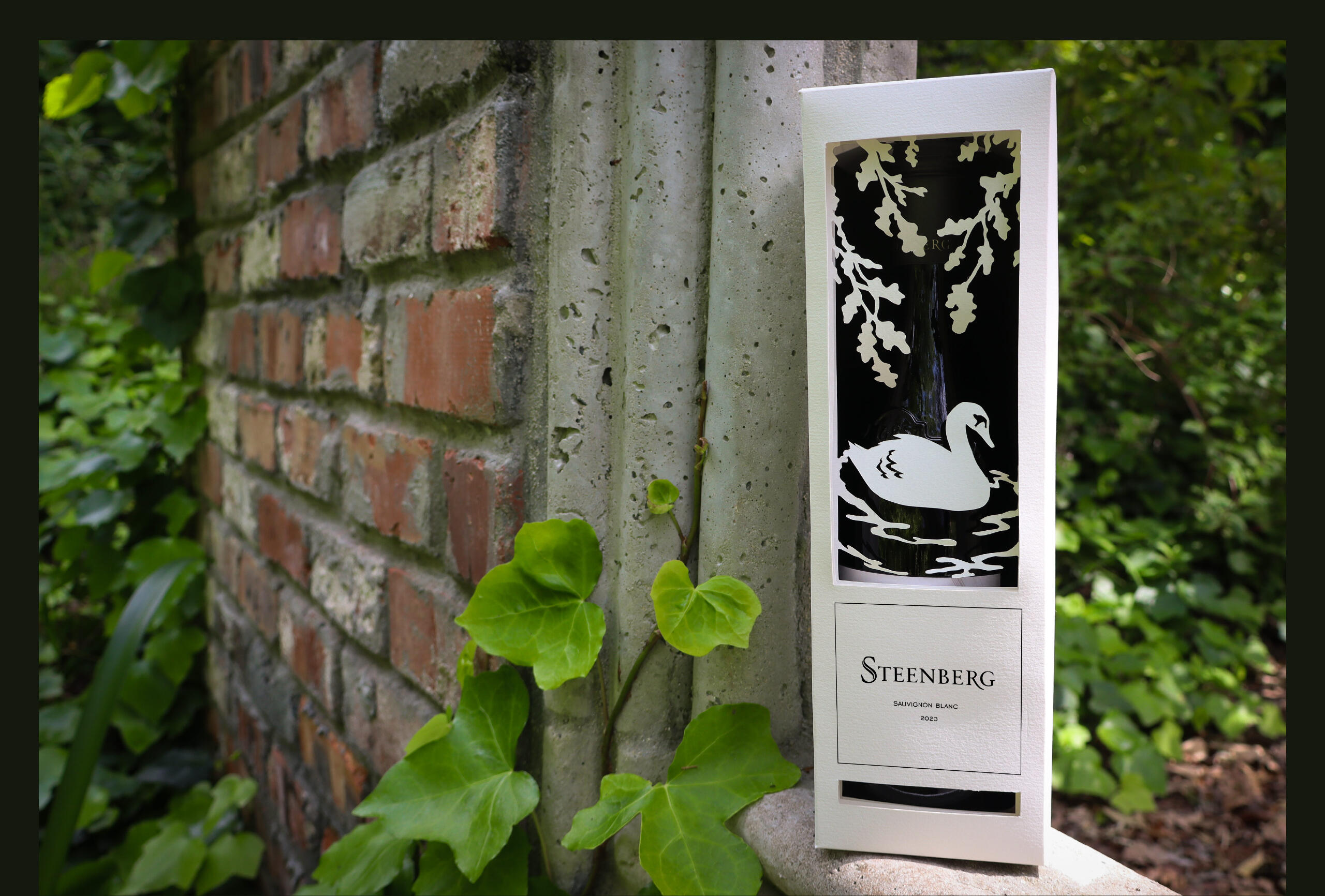
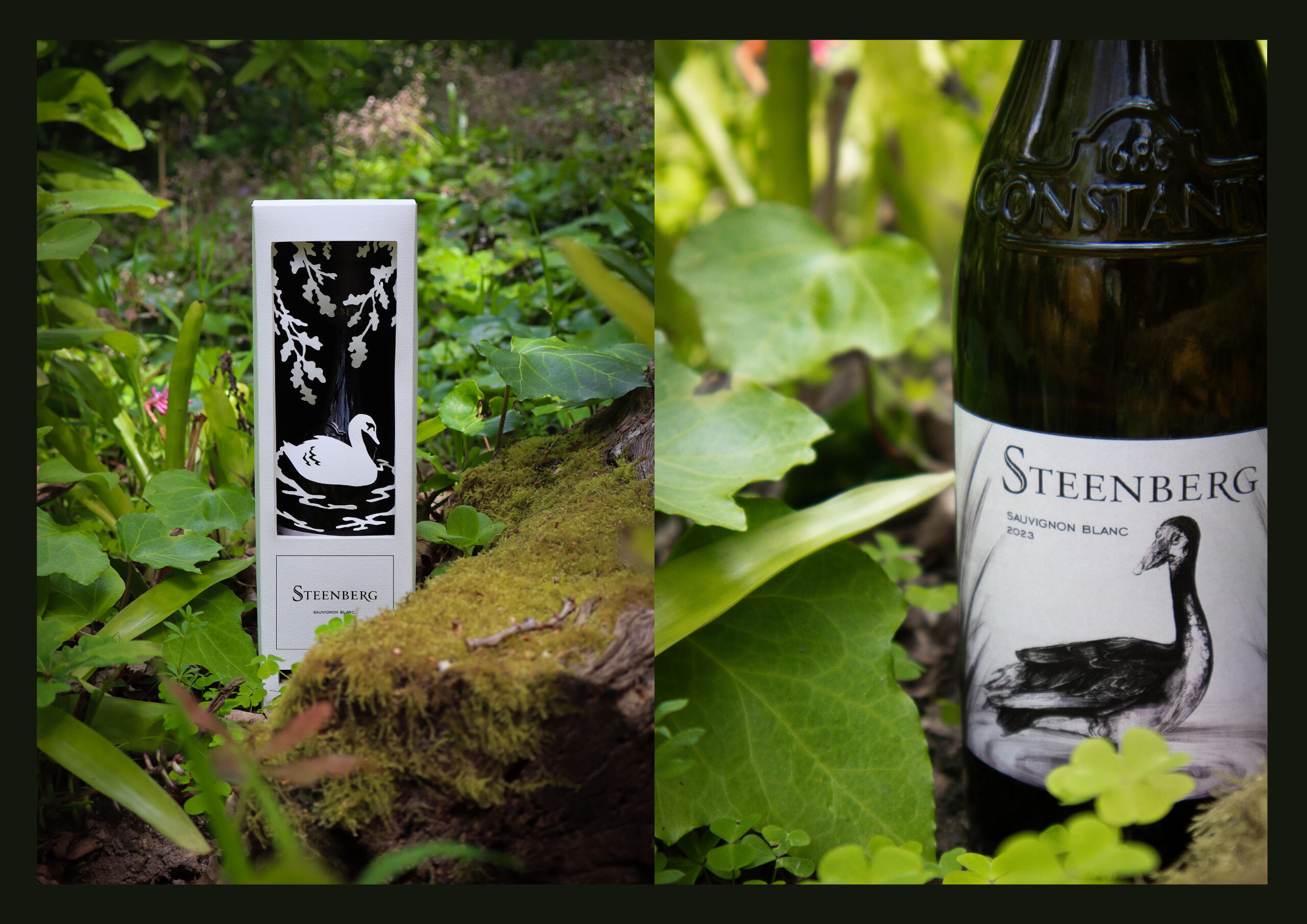
The founder of Steenberg, Catharina Michelse, initially named the wine farm “Swaaneweide”, translating to “the feeding place of swans”. Blinded by her nostalgia for her home country of Germany, Catharina mistook the spur-winged geese that walked amongst the land for swans.Inspired by the early beginnings of the farm, this packaging draws on the idea of living in the moment; leaving behind nostalgia for a different time in favour of focusing on the present, and simply enjoying the life and beauty of that which is in front of you.The intricate carvings inside the box depict a swan idly floating in water under a canopy of branches. Once unboxed, the wine label itself reveals a spur-winged goose standing tall amongst reeds.
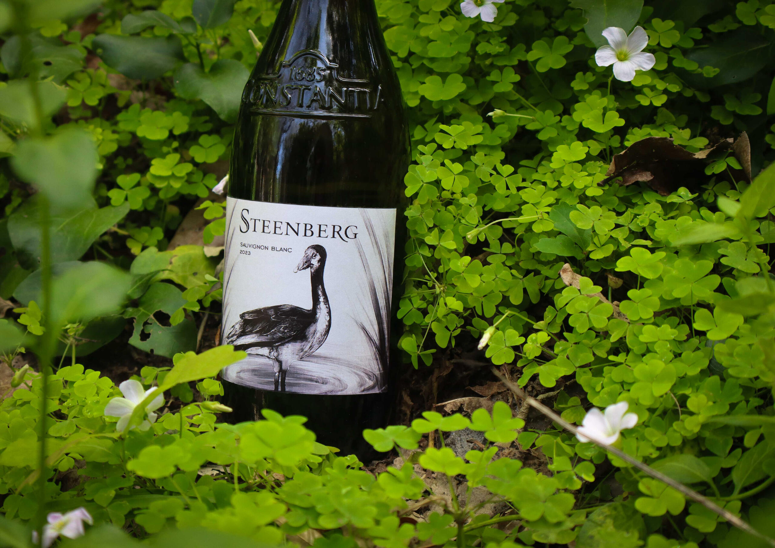
This packaging is designed with artistry and a passion for Steenberg’s origins.The experience of unboxing the wine takes the consumer through a journey symbolic of the origins of Steenberg, and plays on the idea of creating a reveal. Embodying the metaphor of mistaking geese for swans, the packaging leads an individual to focus on the present—the experience that is this wine—while indulging in a bottle of Steenberg’s finest.This luxurious packaging is crafted using high-quality, premium card, featuring intricate detail-work carved out to create a stunning, tangible experience that is unique and unlike any other readily available for purchase.
See What They Hear
PROBLEM
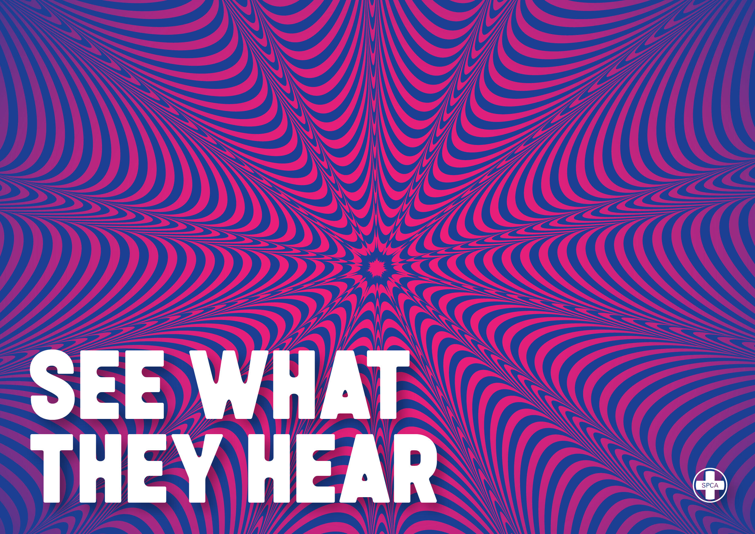
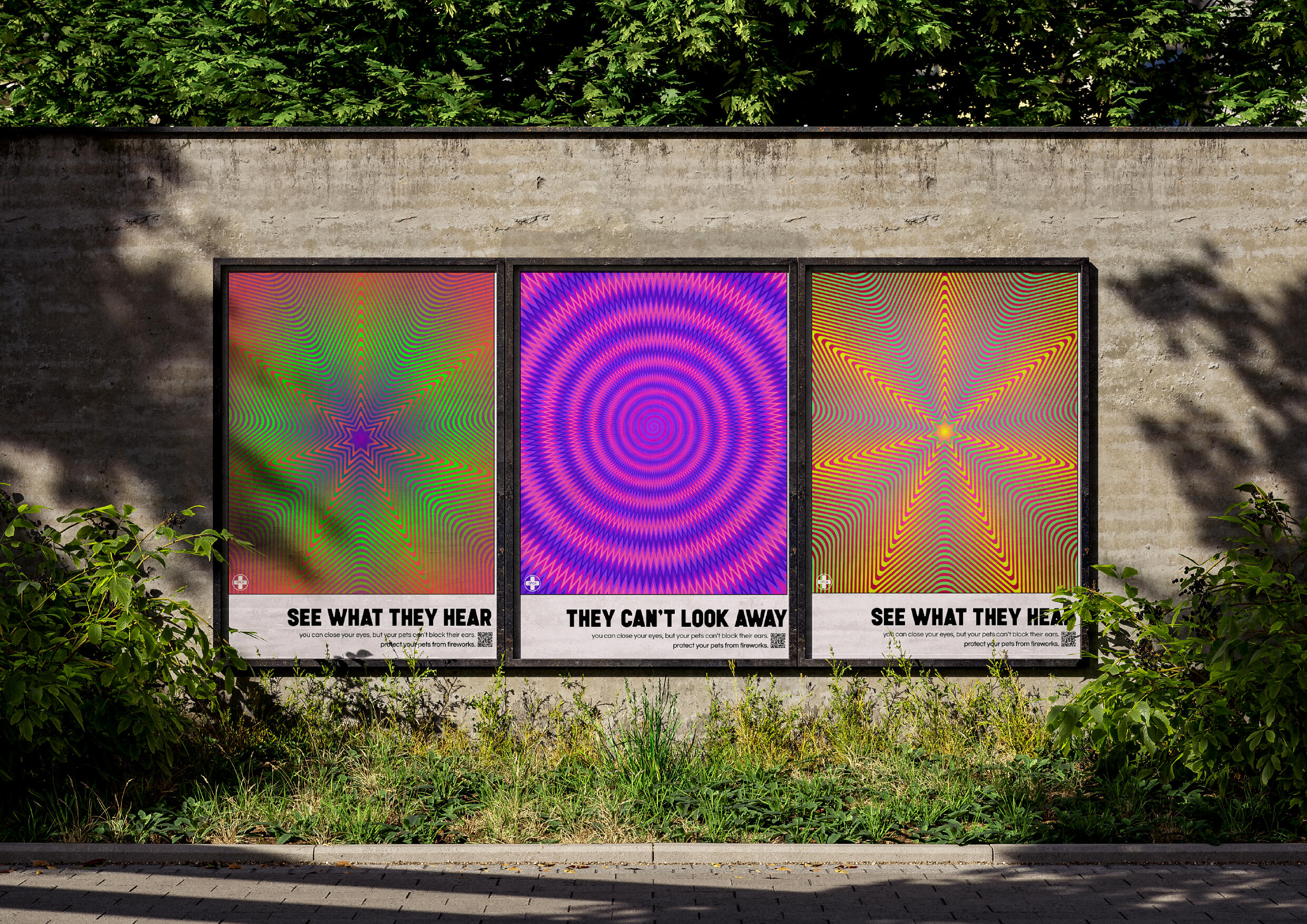
Despite the general consensus that fireworks are unpleasant for household pets, people are unable to empathise with pets, often being misinformed or entirely oblivious to the reality of the situation and the severity of the trauma firework exposure can cause our beloved pets.OBJECTIVE
To translate the severity of the distress household pets experience at the hands of fireworks in a manner in which people can understand. This campaign strives to discourage people from purchasing and using fireworks by showing the effects fireworks have on animals in a manner that is comprehensible and impactful.CONCEPT
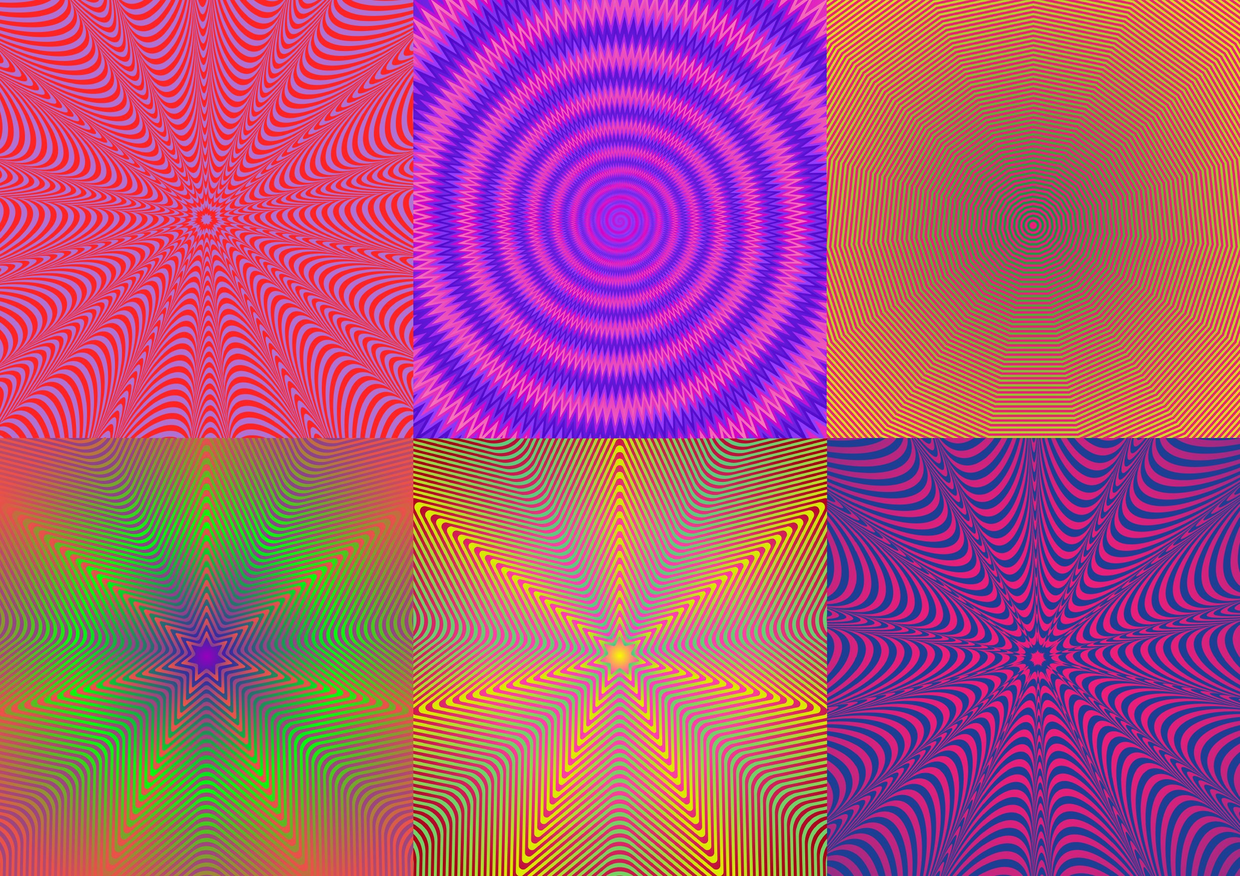
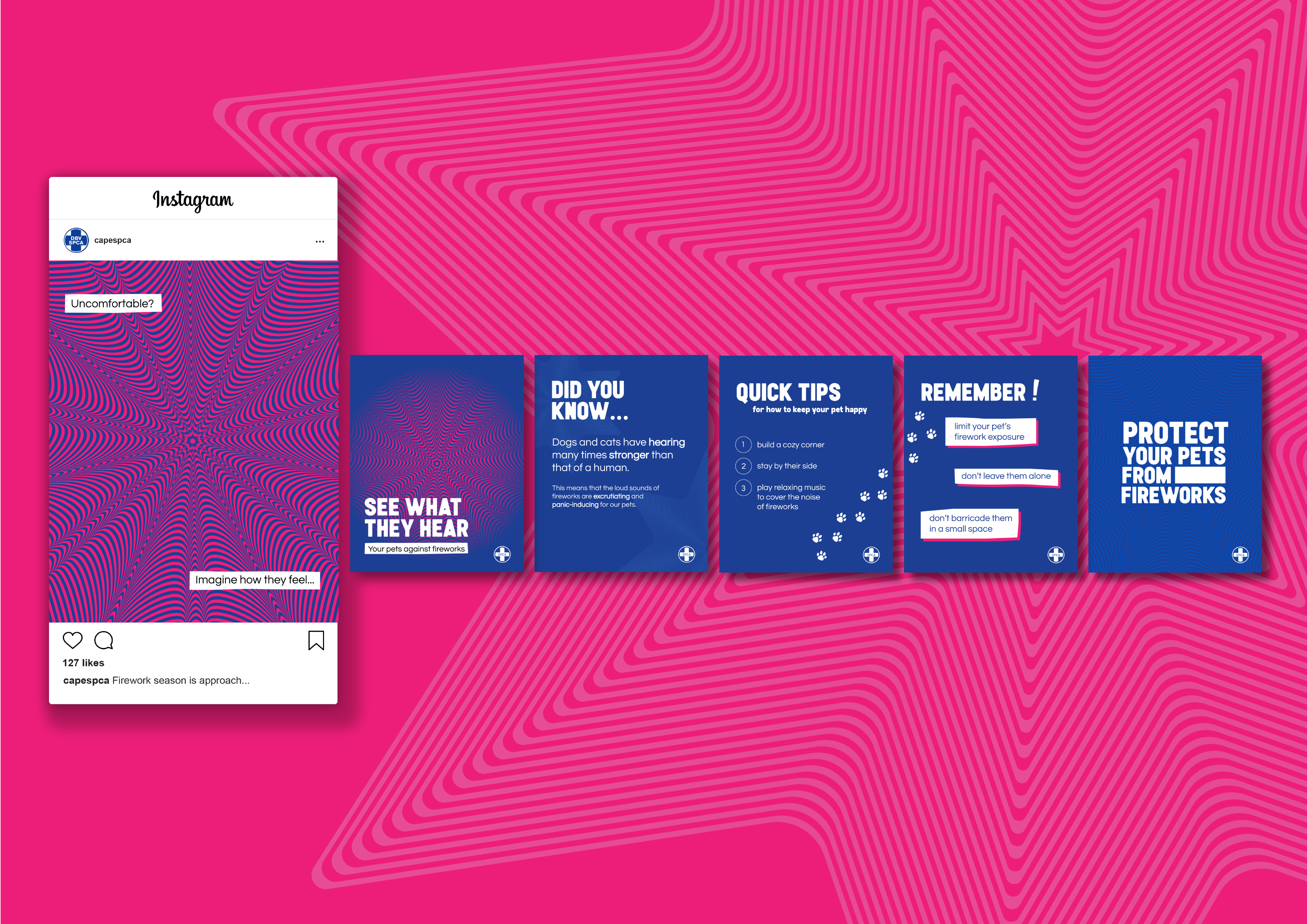
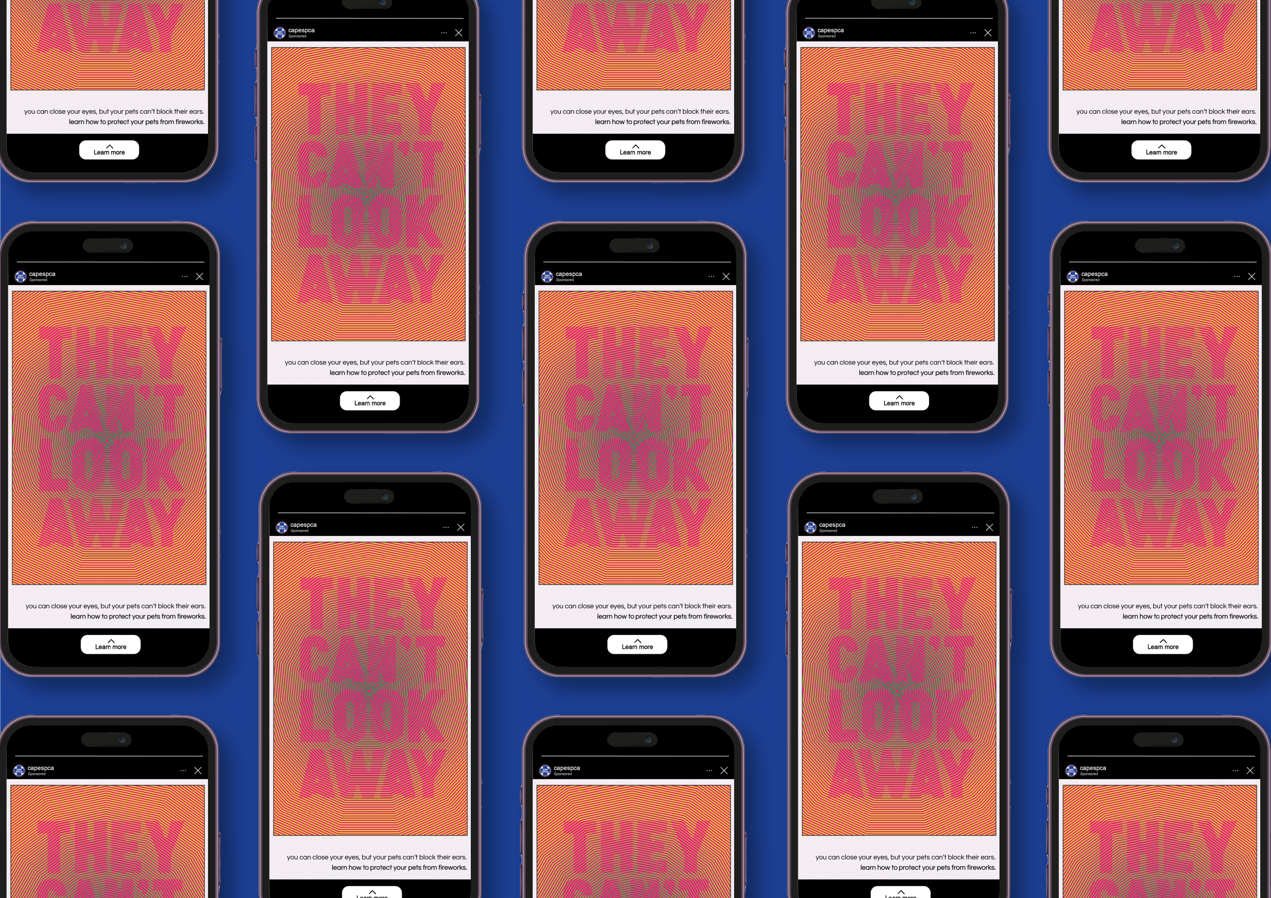
“See What They Hear” strives to make viewers understand the distress pets suffer through at the hands of fireworks by making use of, and ‘manipulating’, the senses. While fireworks are, for the most part, an auditory experience for our pets, we as people have a difficult time comprehending the severity of the noise as it is relatively muted to our ears. Because of this, “See What They Hear” converts the dreadful sound of fireworks as experienced by our pets into a different medium—visualising them in a manner that encapsulates the discomfort and unease through imagery that can affect the human eye.
Picnic Cafe and Deli Rebrand
OBJECTIVE
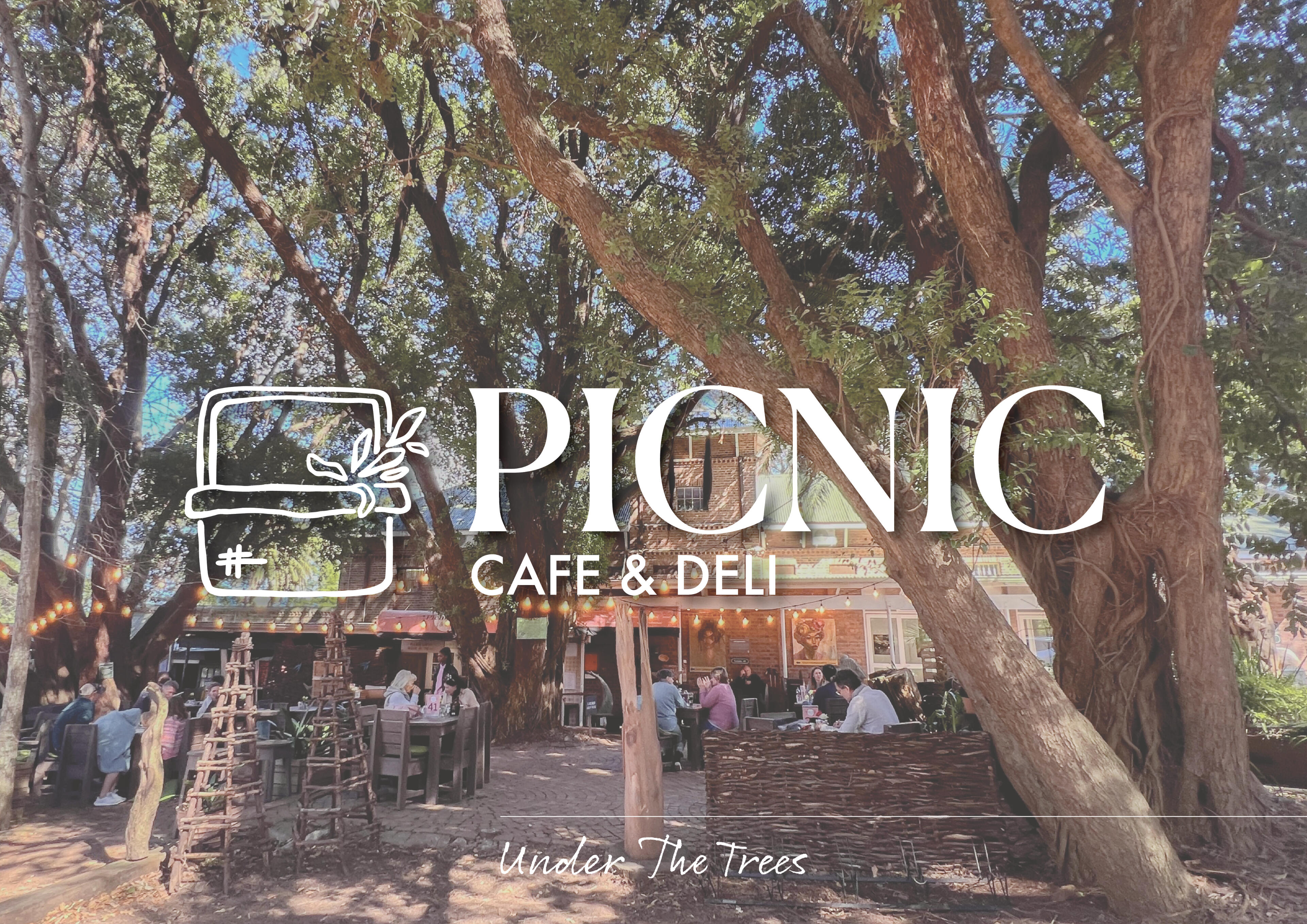
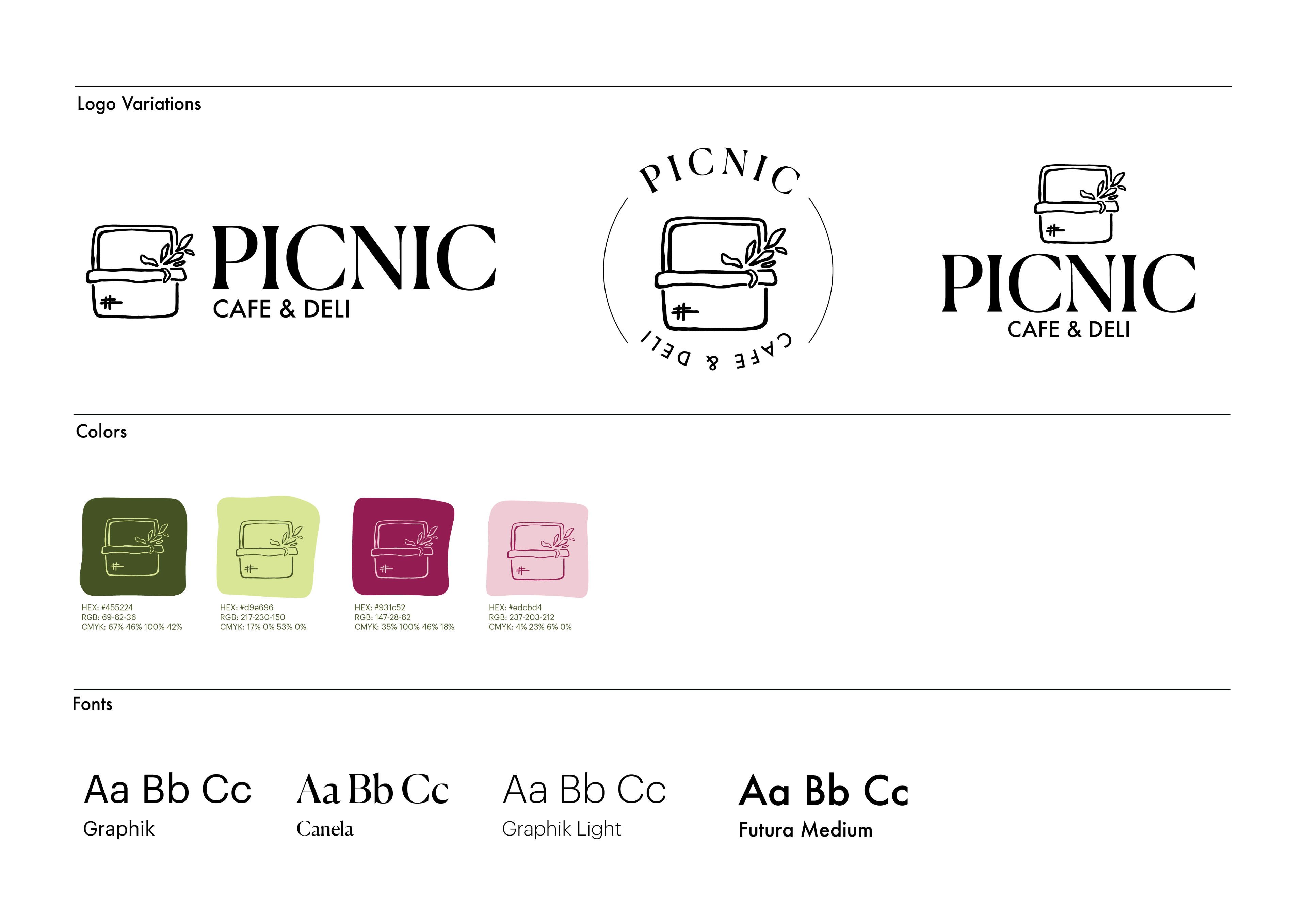
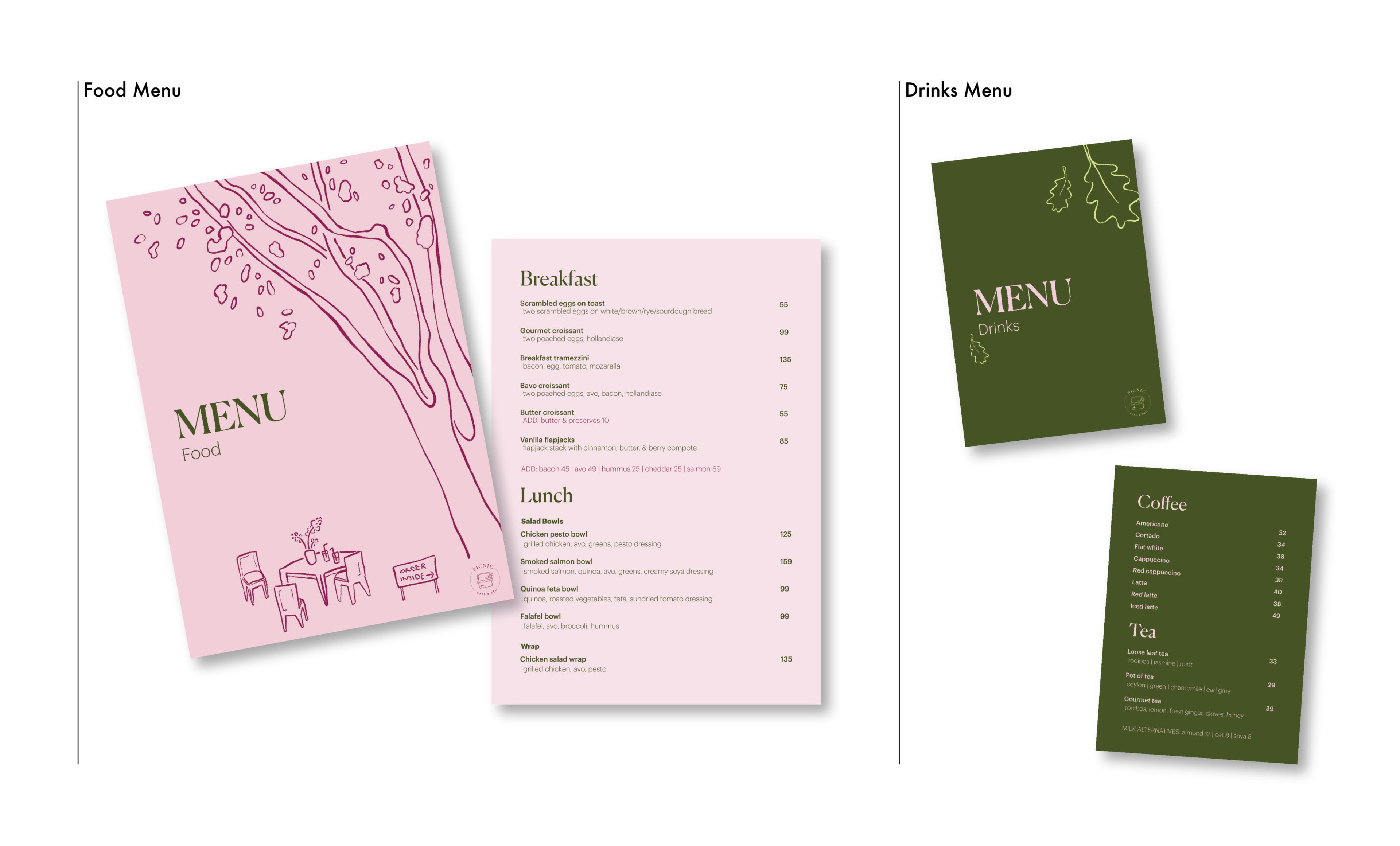
To rebrand Picnic Cafe & Deli, a cafe located in Newlands, Cape Town. This brand identity serves to give the cafe a new life, inviting a new Gen Z audience to use the cafe as a relaxed third place where they can reconnect with nature, the community, and themselves.INSIGHT
We as people need to reconnect with our community and the natural world, as having time dedicated to our peers and the outdoors is what allows our lives to feel fulfilled.CONCEPT
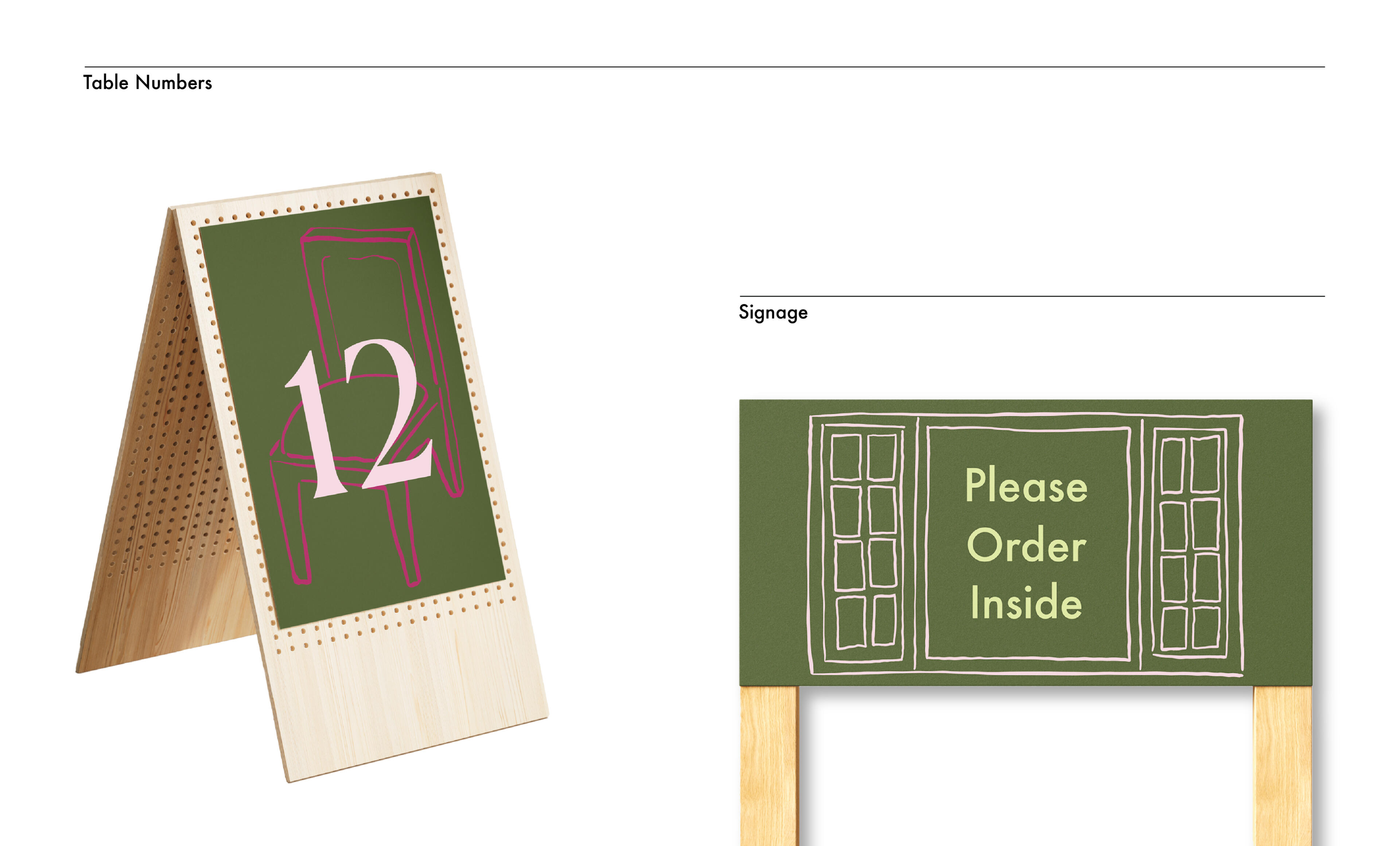
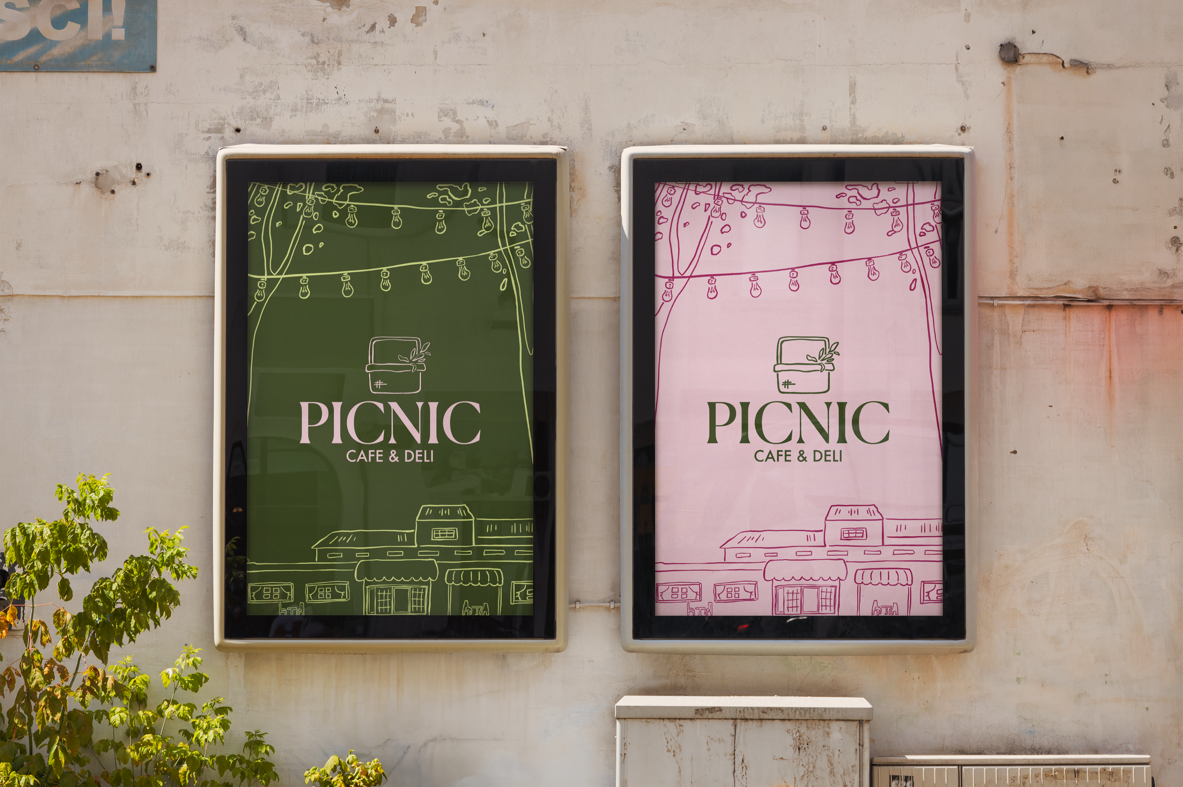
"Under The Trees" gives Picnic Cafe & Deli a new, relaxed and artistic visual identity, inviting the youth of Cape Town to see the space as a safe space where they can relax and simply exist. This new identity focuses on encouraging people to spend time within the establishment, together. The illustrative style depicting the different areas of the cafe found across all touchpoints allows the cafe identity to maintain the crafty, rustic look that the establishment itself has. The soothing color palette is reflective of both the natural environment the cafe is situated in, as well as the previous brand identity, which was mostly made up of light pink.
Reignite Your Humanity
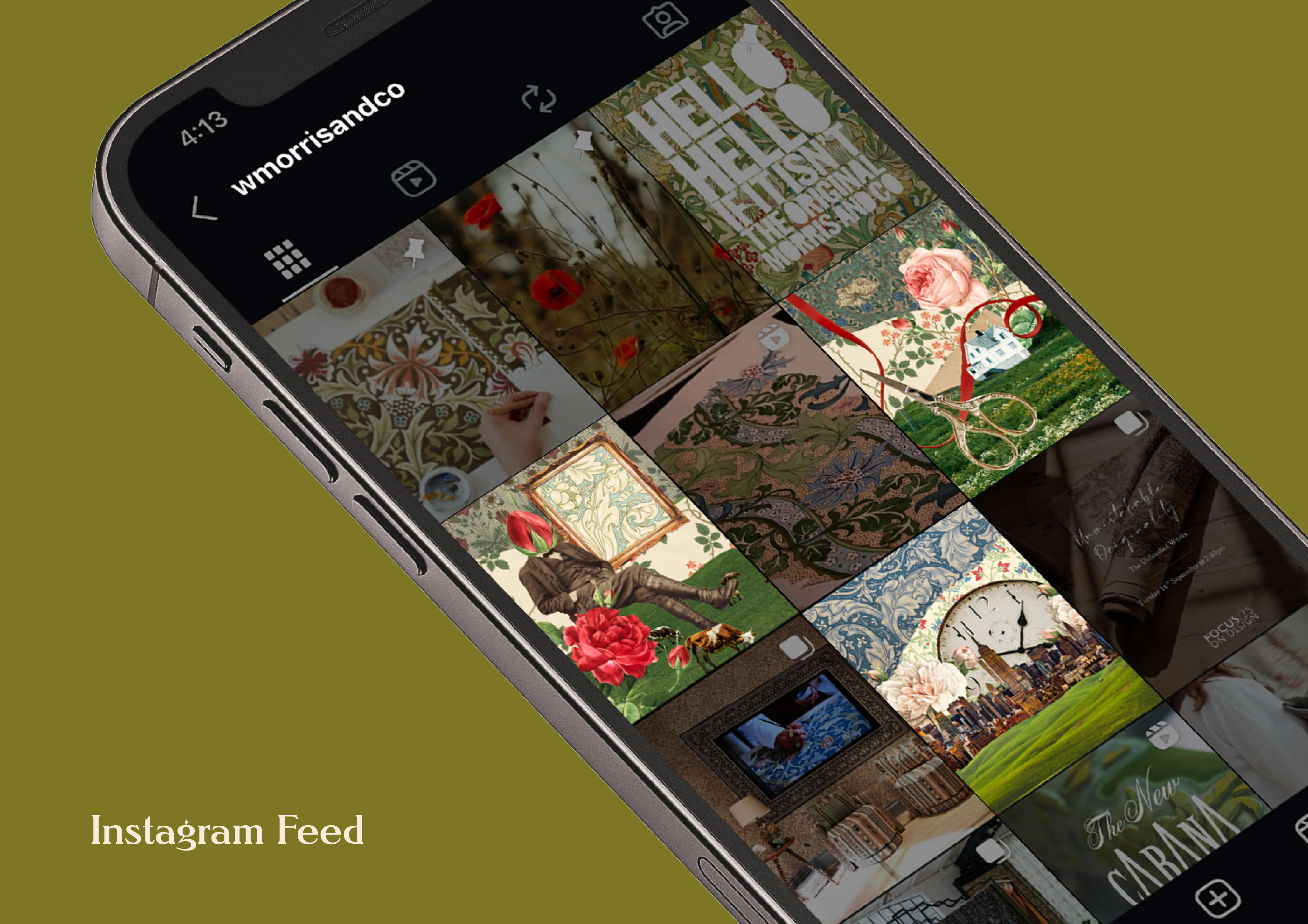
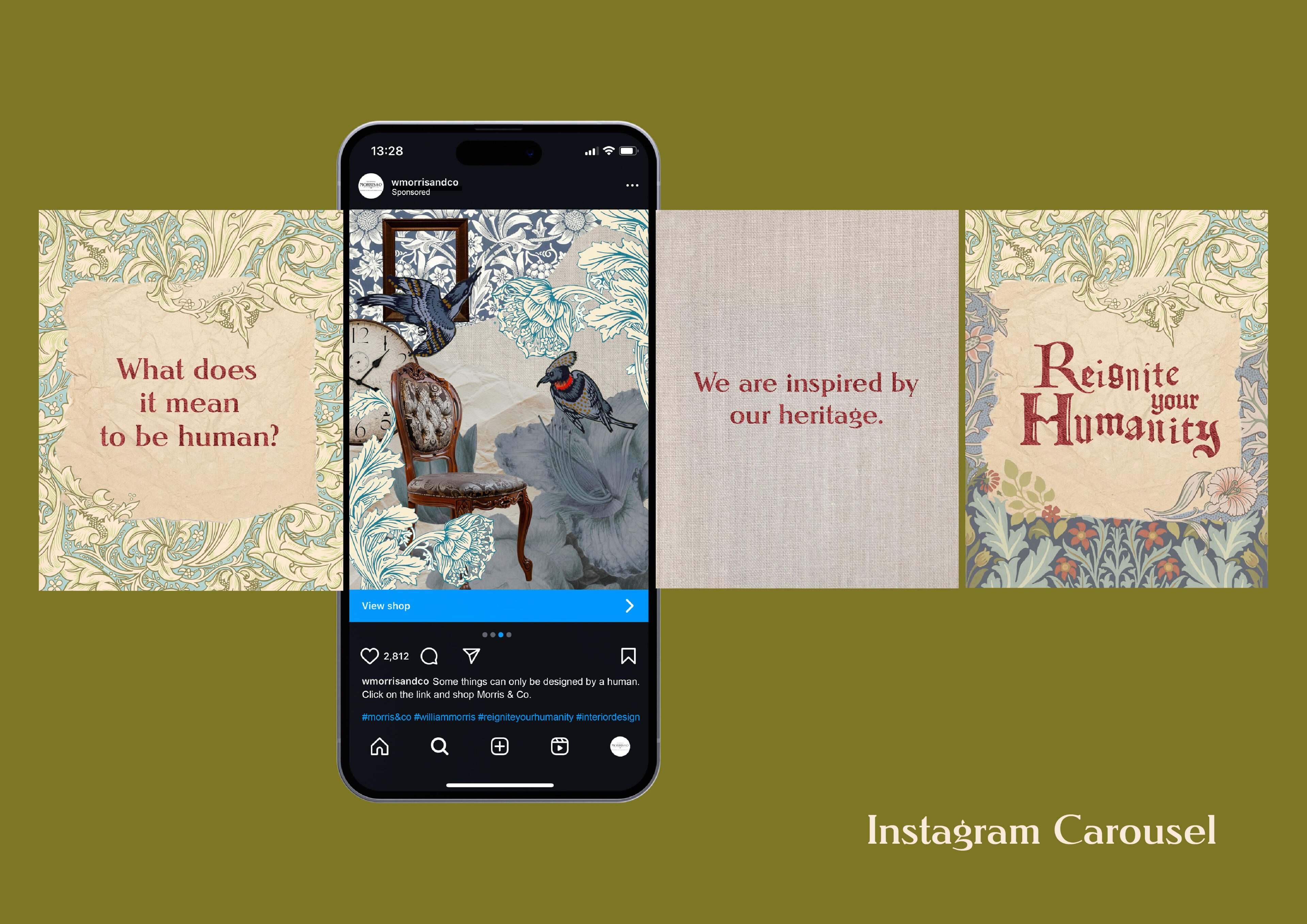
Reignite your Humanity is a commentary on the bland, lifeless landscape we currently find ourselves within at the fourth stage of the Industrial Revolution, with artificial intelligence (AI) infiltrating creative spaces and slowly pushing humans out of the picture. What was once a field that stemmed from human hands, creating and pouring ourselves into pieces of craft, art, and design, has now become overrun with programmes and bots.Due to the speed and cost efficiency of it, AI has now become commonplace in the creative field, generating visuals and ideas that lack depth, emotional capacity, and oftentimes even sense, in favor of hiring real artistic professionals for the job.This campaign aims to bring consumer attention towards the AI epidemic, bringing light to the fact that a computer could never replicate what is required to create something meaningful: the human experience; the emotional weight and understanding that is integral to being a person.Collages are something intrinsically human - as we are compelled to collect and craft, collages are pieced together through different facets of life, different experiences lived and memories collected.Through the three themes of heritage, craft, and reimagination the campaign tells the story of Morris & Co’s roots and beliefs.
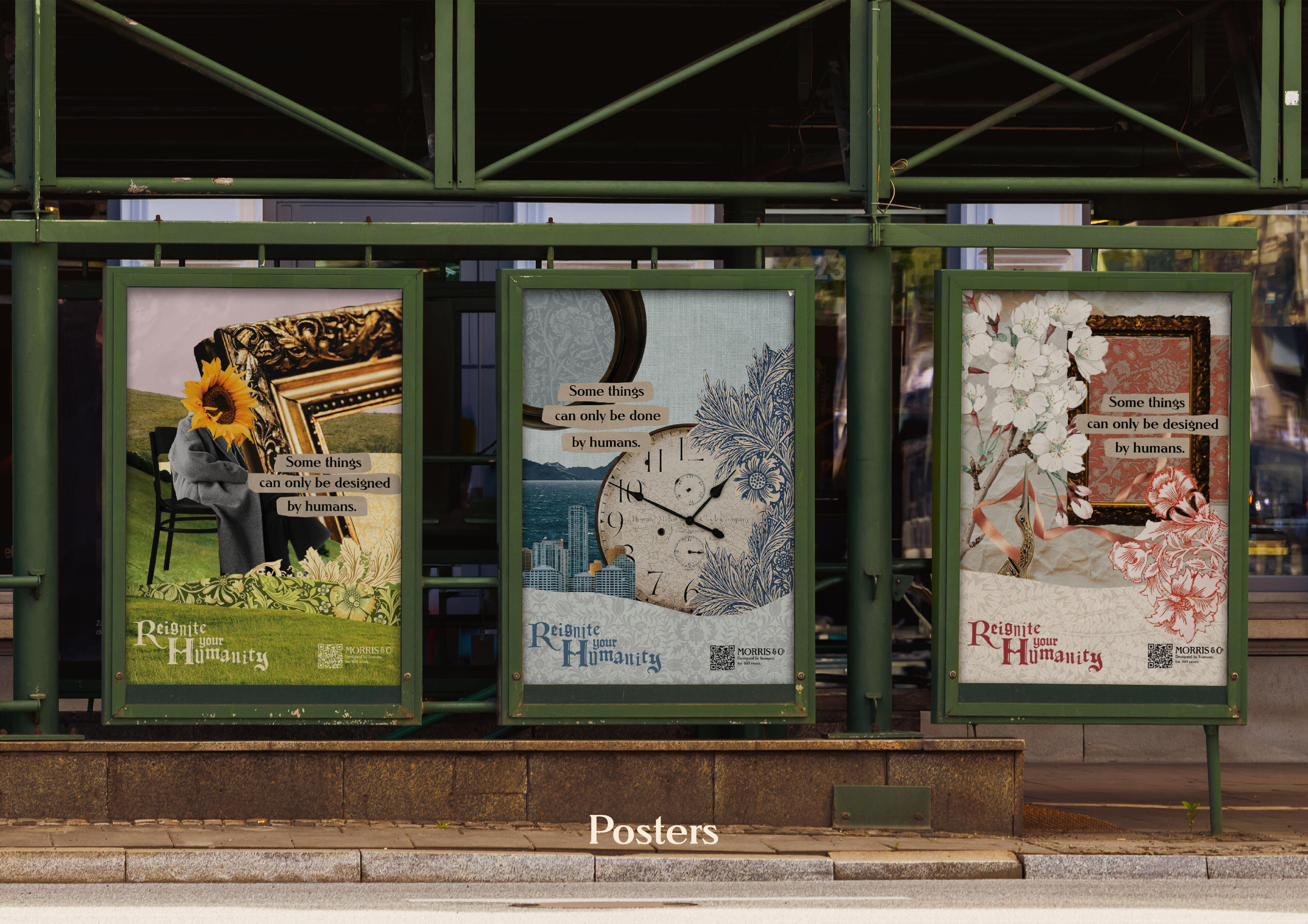
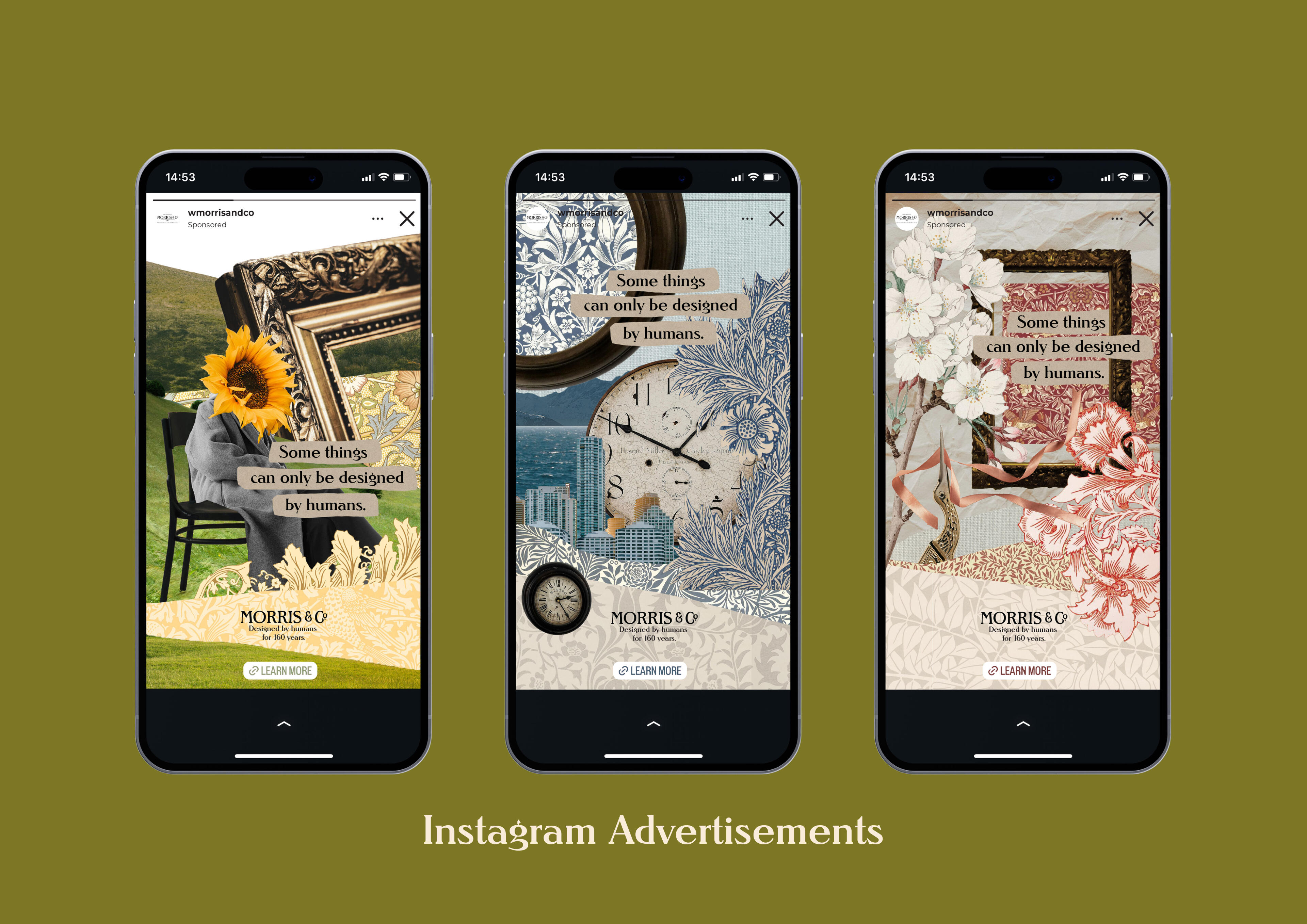
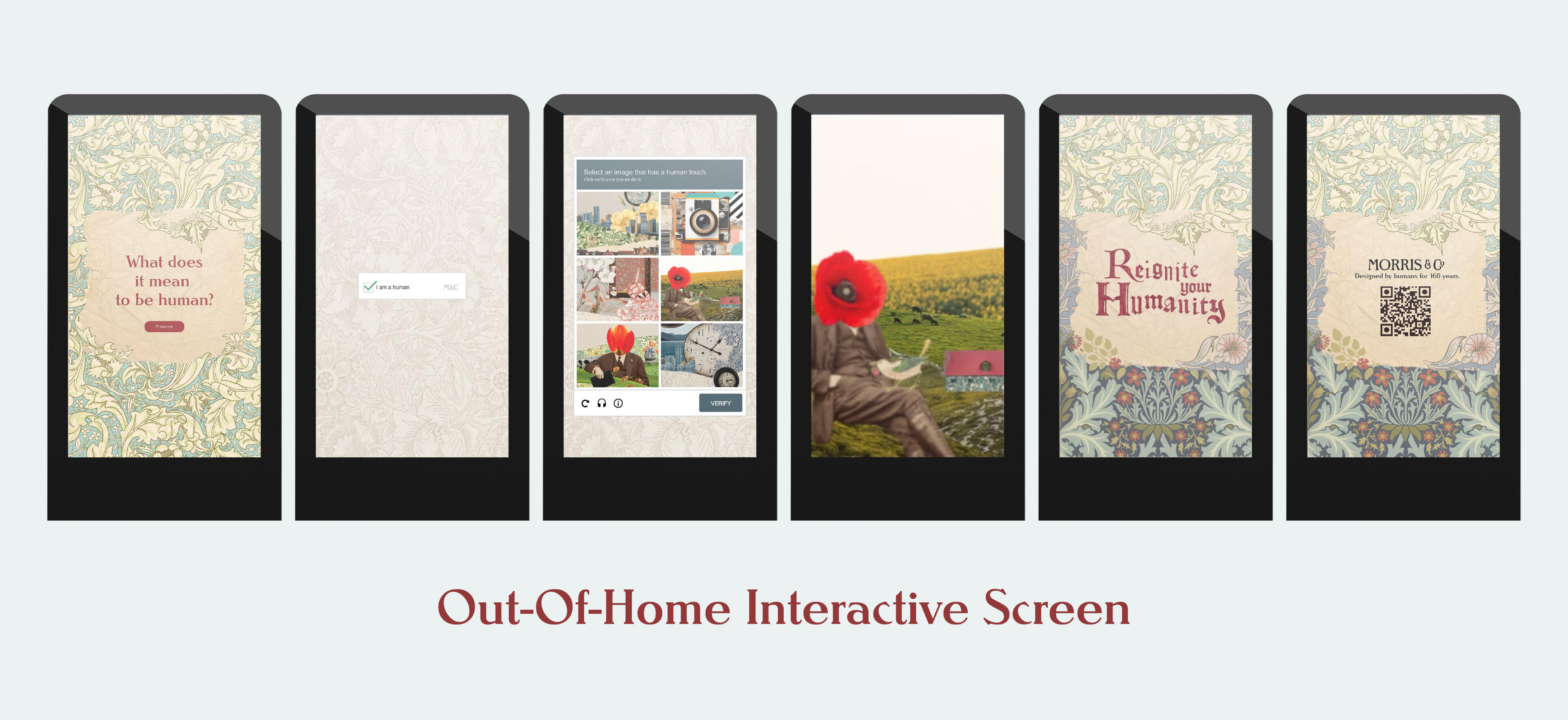
The Out-Of-Home activation is where the experience truly comes to life; here, the consumer interacts with a digital billboard which takes them through a journey of self discovery and recognition.The experience begins with a CAPTCHA, prompting the user to verify that they are a human, playing on the idea that as we further fall into the AI epidemic, we slowly become more bot than human.Next, the consumer will be required to “select an image that has a human touch”, urging them to look for this humanity within themselves. Once they do so, they are taken through an animation depicting a collaged world of images and patterns, with each collage representing craft, reimagination, or heritage. Finally, the experience concludes with the call to action, urging the viewer to “Come Find Yourself” [at Morris & Co], imploring the consumer to reignite their humanity through Morris & Co.
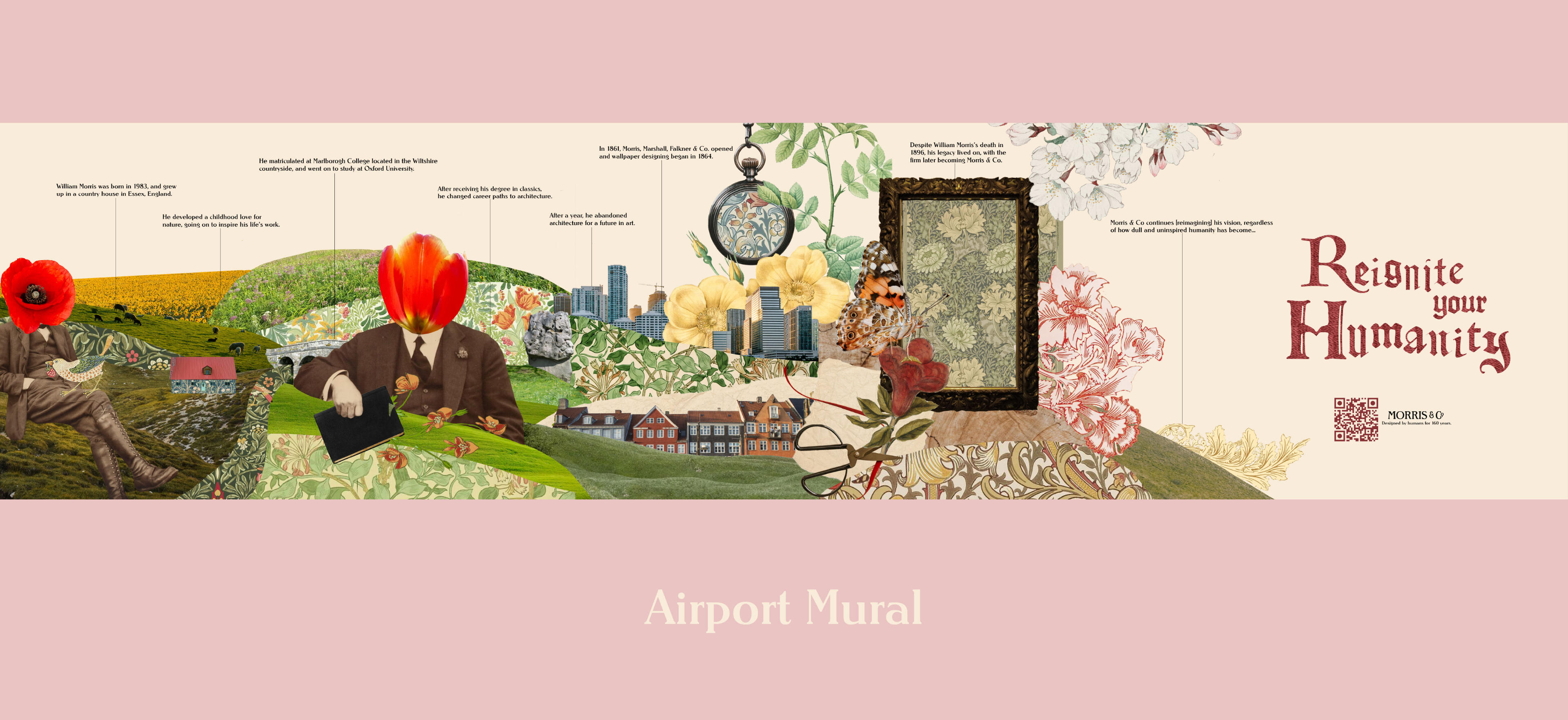
As an individual walks along the stretch of the airport on their way to baggage claim, they are able to be introduced to and discover the tale of Morris & Co in a visually exciting and capturing way through the airport mural.
This project was created in collaboaration with
Emma Clough, Danica Viljoen, and Daniel Krige
The Foundations of Parasitism
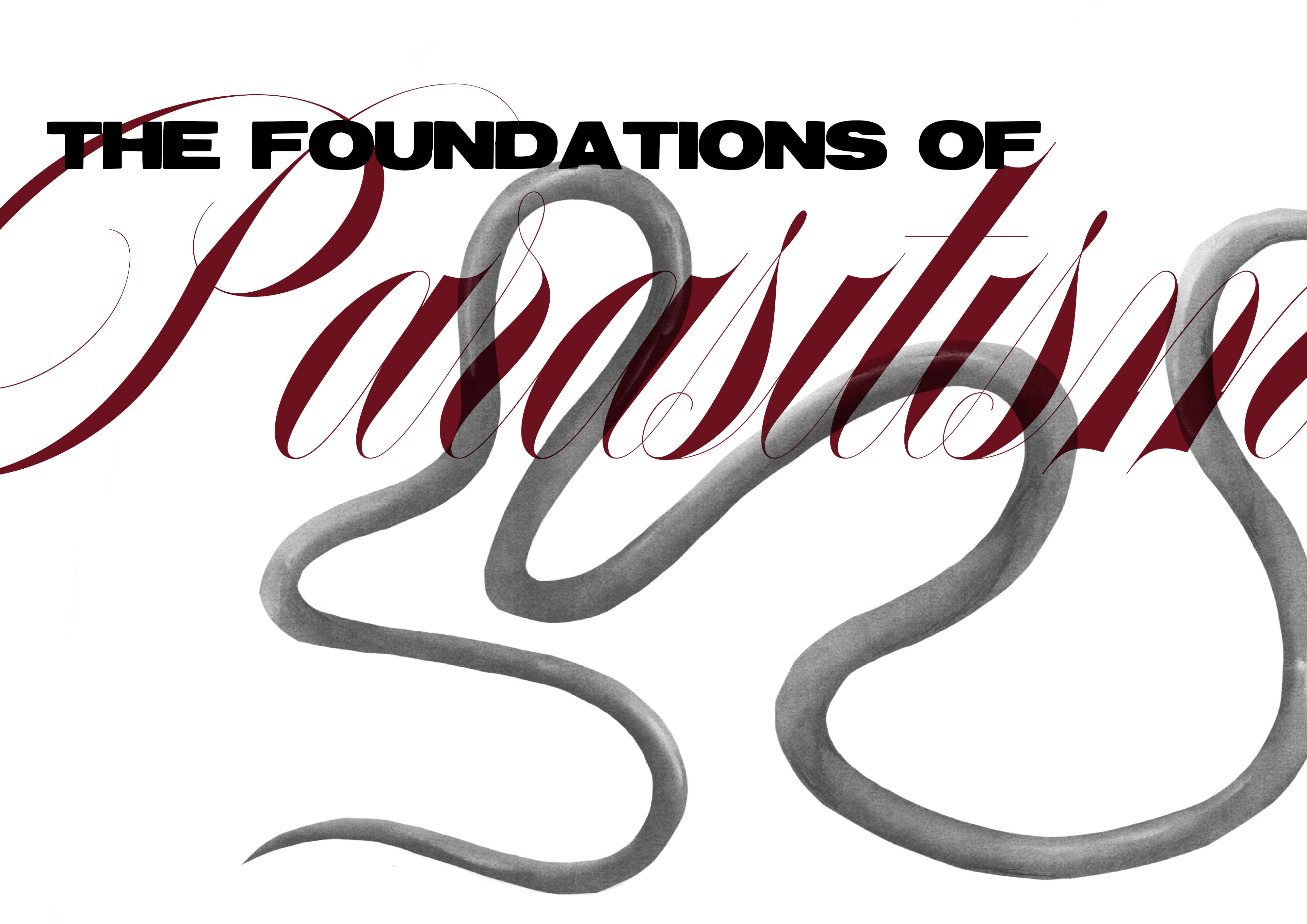
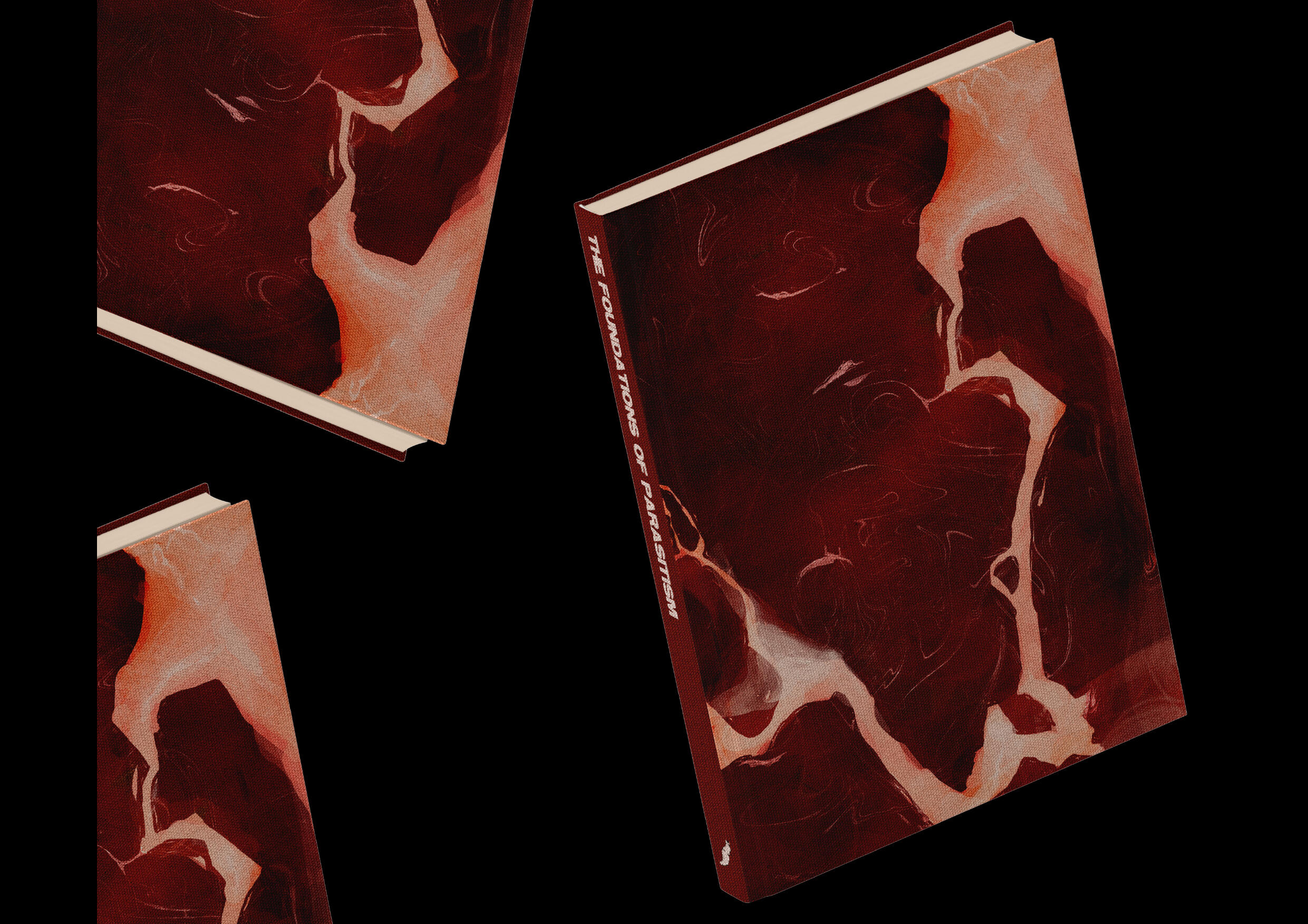
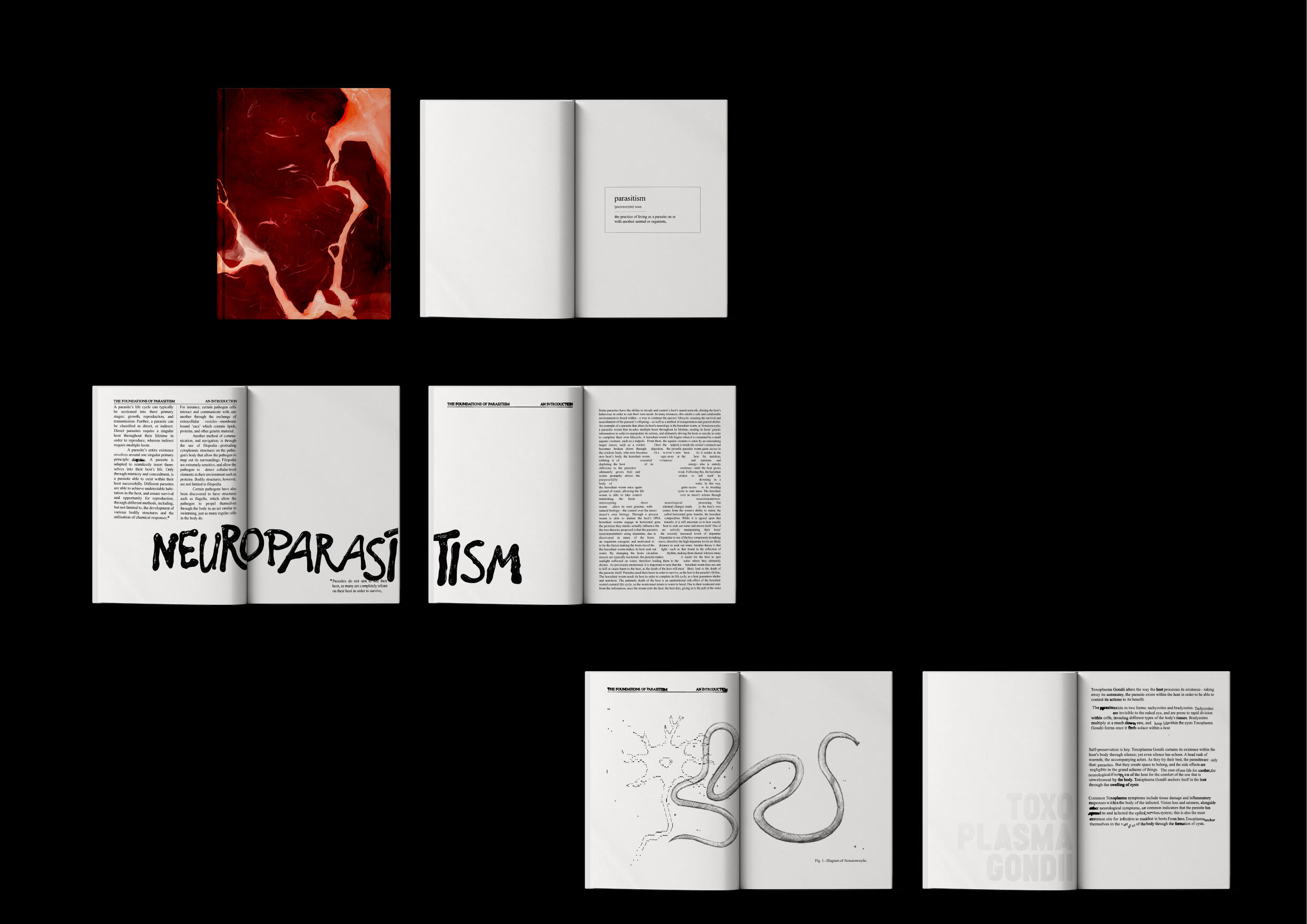
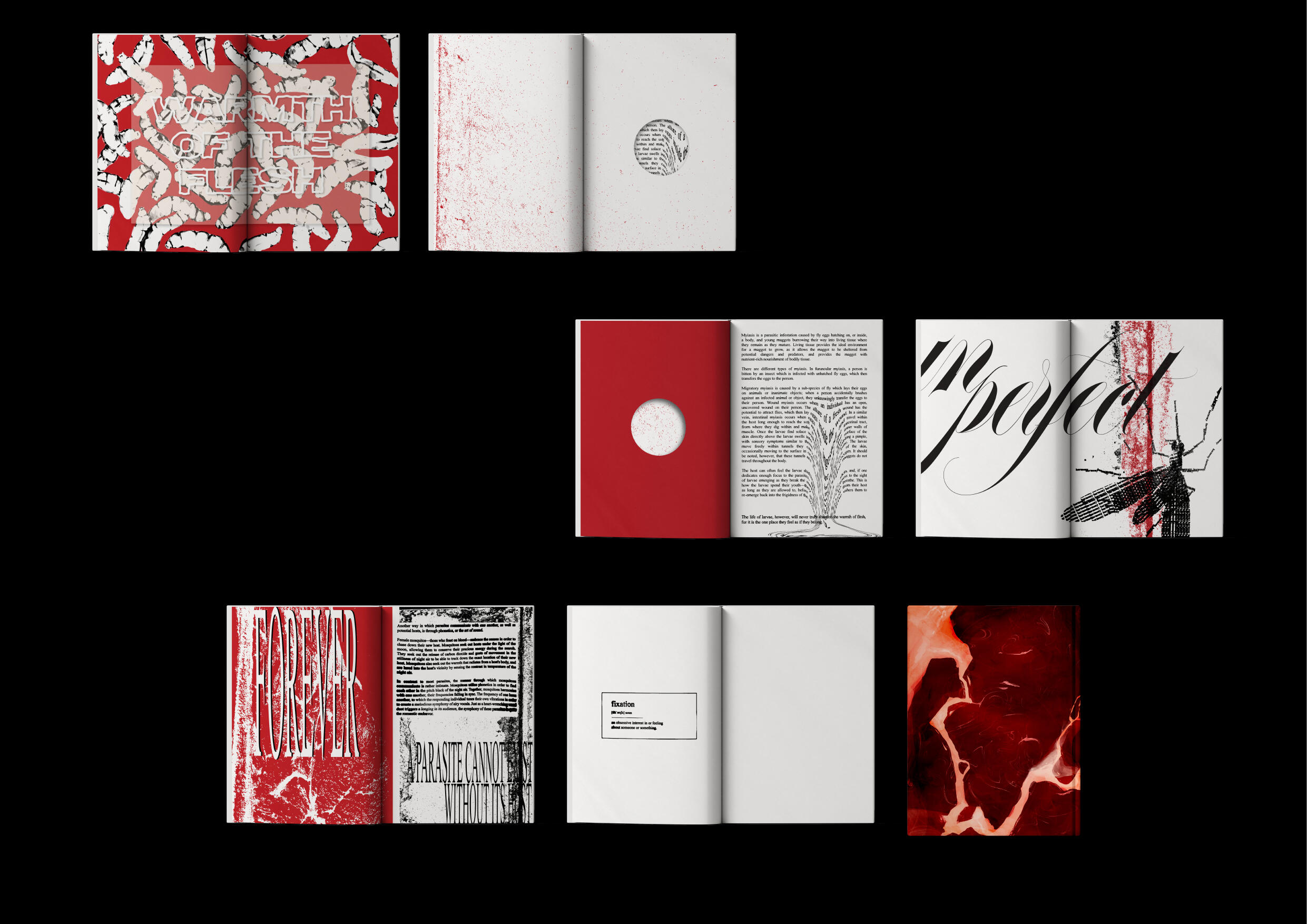
People become so wrapped up in their own infatuation with another that they become unable to recognise the harm in their actions; they are so absorbed in their feelings—their need for connection with this person—that they tunnel vision into only satisfying their own cravings, disregarding the harm it causes the other individual.Humans crave—by nature we are insatiable, in our possessions and experience, always hungry for more. This greed can slip into personal relationships too—fixating on a person and suffocating them for our own benefit. As parasites seek refuge in a host, invading another organism's life to appease their own needs, so do people in one another.Parasites and humans are grossly similar in nature, from our need for intimacy to our greed.
Jobless Behaviour
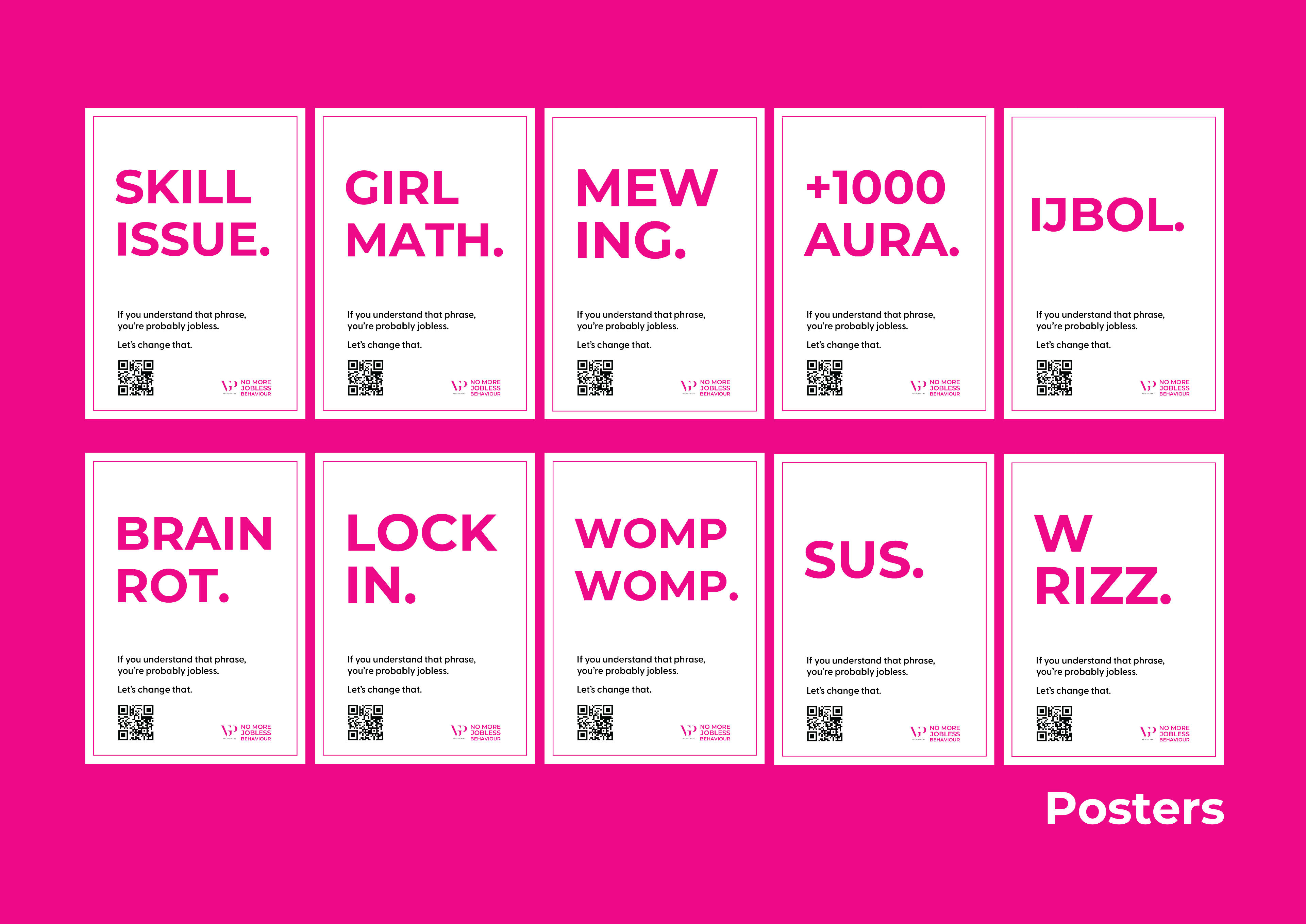
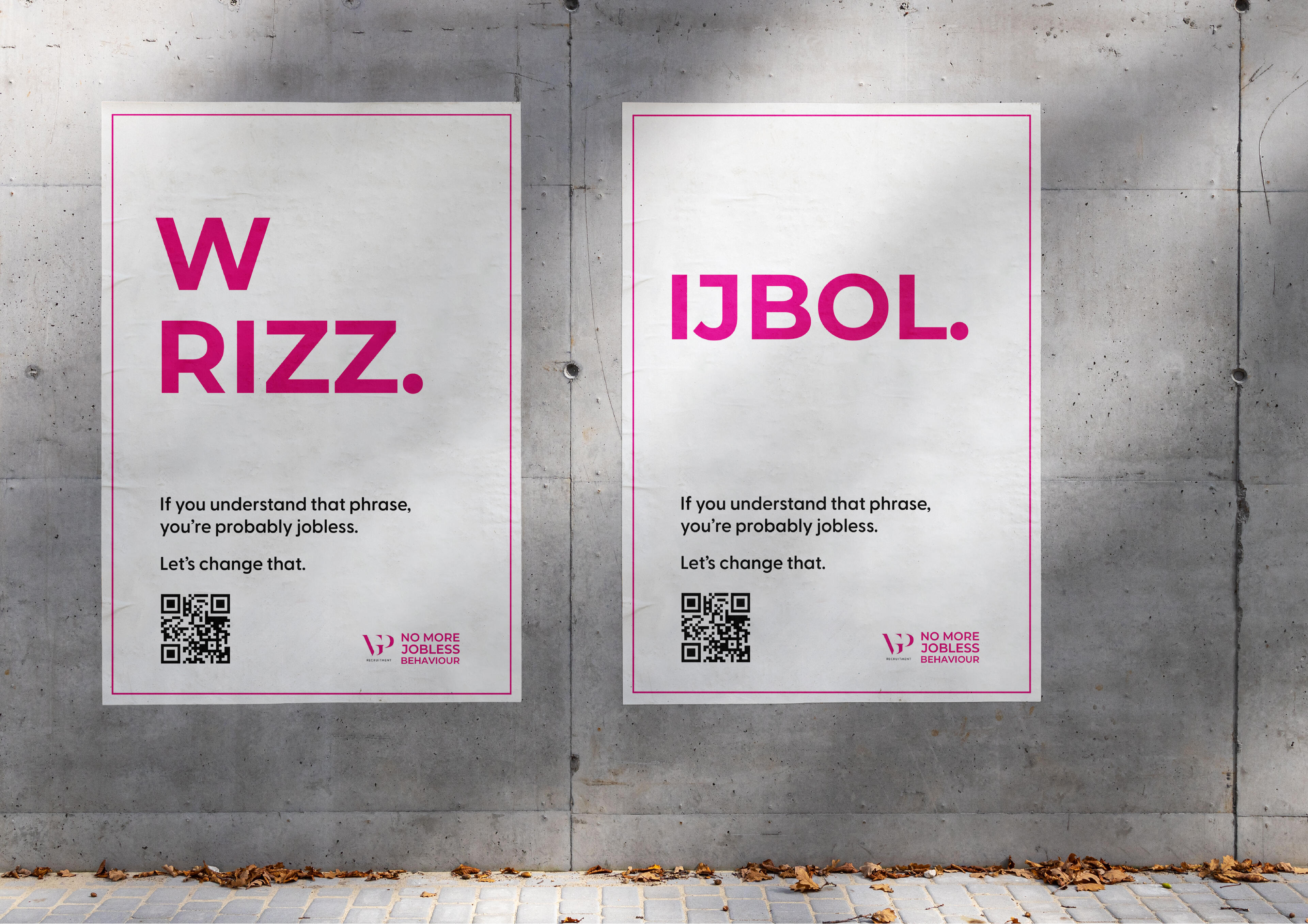
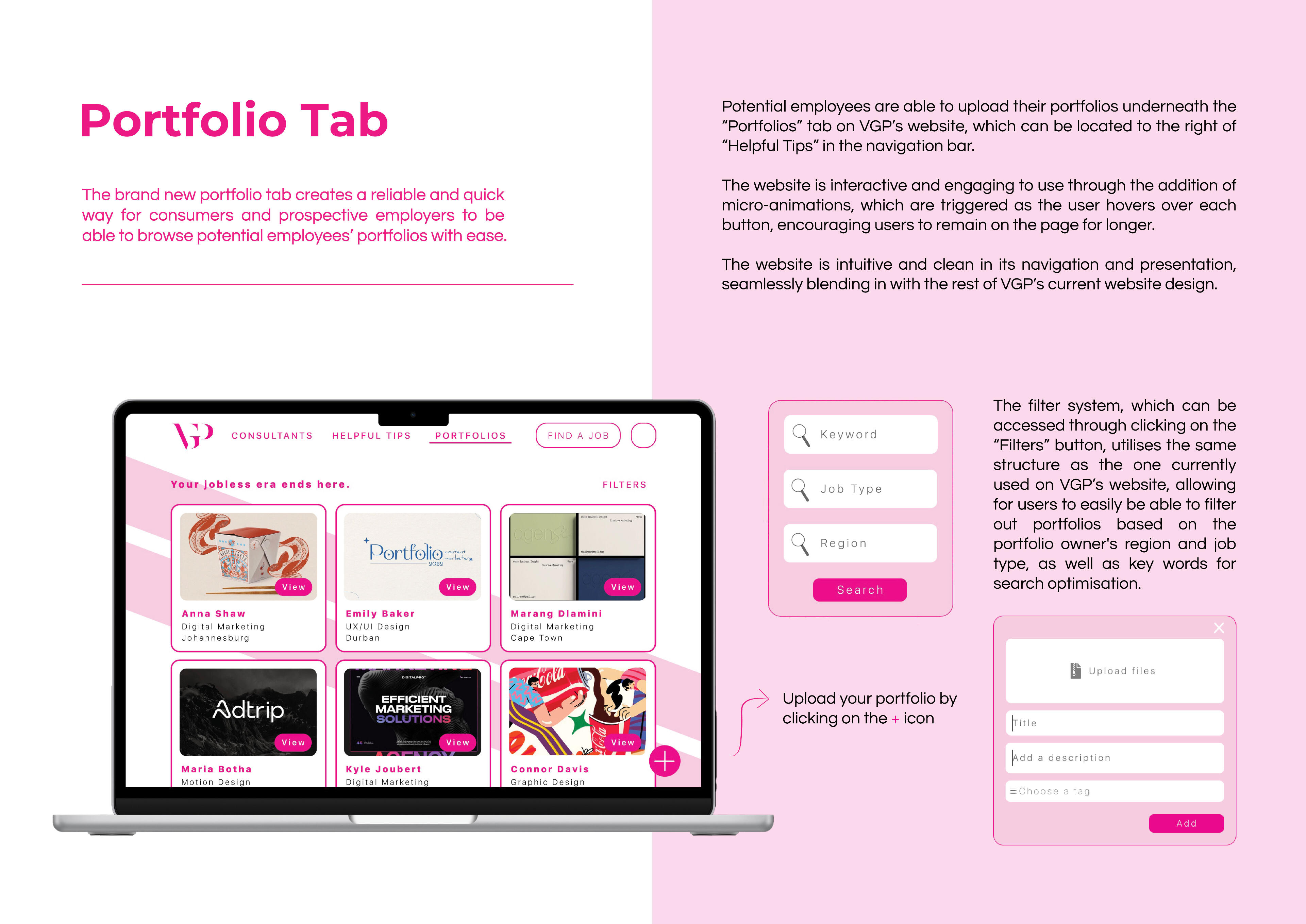
The objective of this campaign is to develop a relatable marketing campaign that positions VGP Recruitment as a youthful brand that a Gen Z audience is able to connect with on a personal level."Consumers are more inclined to engage with and trust a brand if it is modern and appeals to their current interests and niches that they are familiar with."The concept of Jobless Behaviour relies on utilising online slang in order for VGP to familiarise themselves to a Gen Z target market. Through the use of internet slang, the campaign positions VGP as a trendy, relatable company, allowing it to be perceived as trustworthy in the eyes of the consumer. Utilising internet slang that’s often contained within niche online spaces allows the campaign to come across as humorous and slightly shocking, allowing it to be eye-catching and memorable.The title “Jobless Behaviour” is a nod to the phrase of the same name that has been a relevant meme amongst Gen Z for years.

Just Another Letter
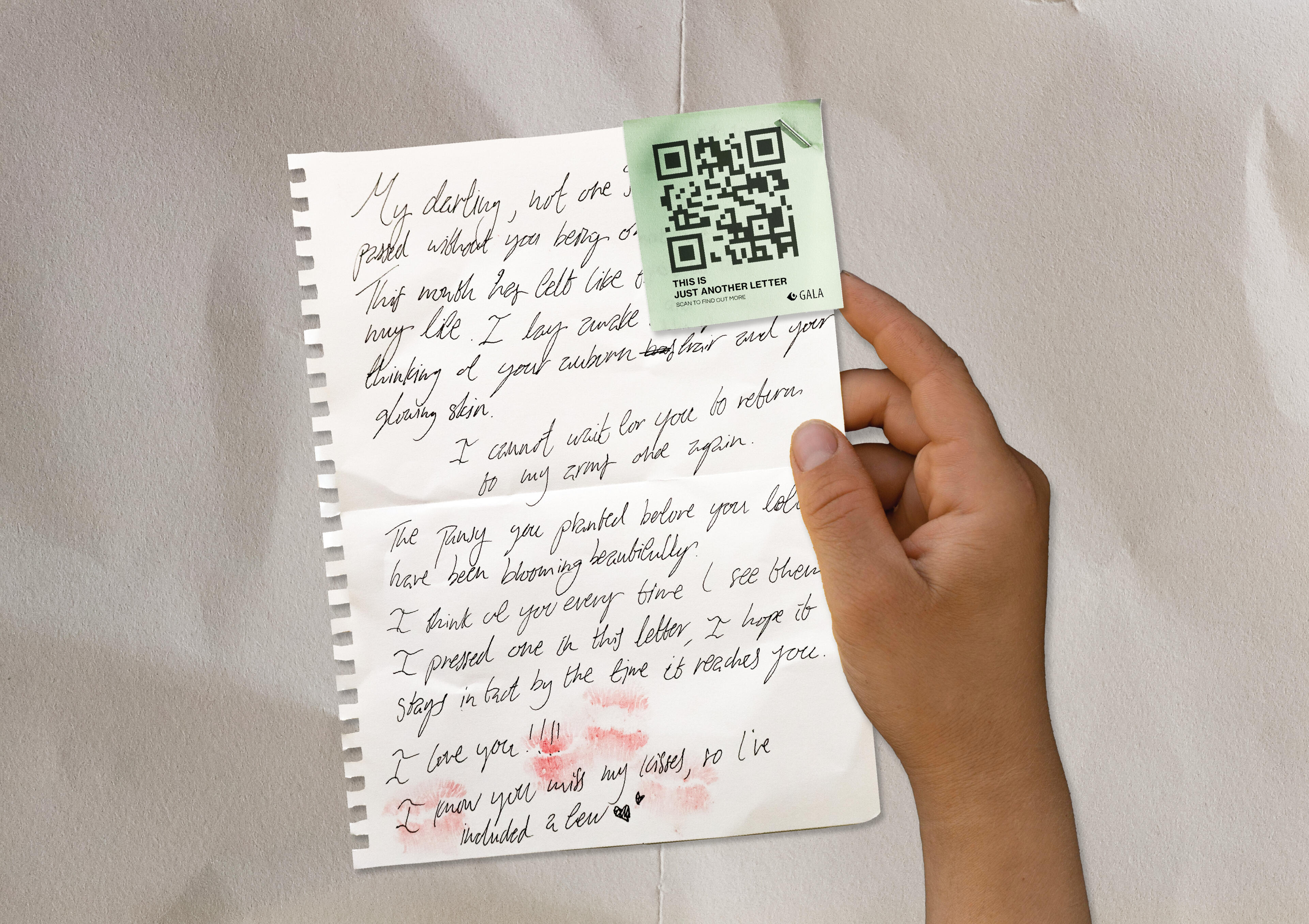
The objective of this integrated campaign is to partner with GALA Queer Archive in order to create a campaign that is interactive and emotionally charged, showcasing a part of LGBTQIA+ history which is usually lost to time.There is a severe lack of education surrounding queer history, leading to history becoming forgotten and creating opportunity for false narratives regarding queer people to spread.The beauty of this campaign lies in its simplicity - each letter is hand written by a regular person simply trying to express human emotions, as we all do. “Just Another Letter” focuses on people’s empathy, the emotions poured into every letter being felt through each unique hand-writing. The letters date back decades, having been loved and treasured for years, bringing focus to the fact that queerness has been around since the beginning. Through tapping into human empathy, the campaign invests the viewer, incentivising them to find out more about the campaign, and subsequently, educate themselves on LGBTQIA+ history.The title, “Just Another Letter”, alludes to the fact that, while the focus of the campaign may be that the letters are indicative of queer love throughout history, at the end of the day, each letter is simply just another letter. Queer love has been around just as long as heterosexual love, and queerness is something that is regular and just another part of life.
Instagram Carousel
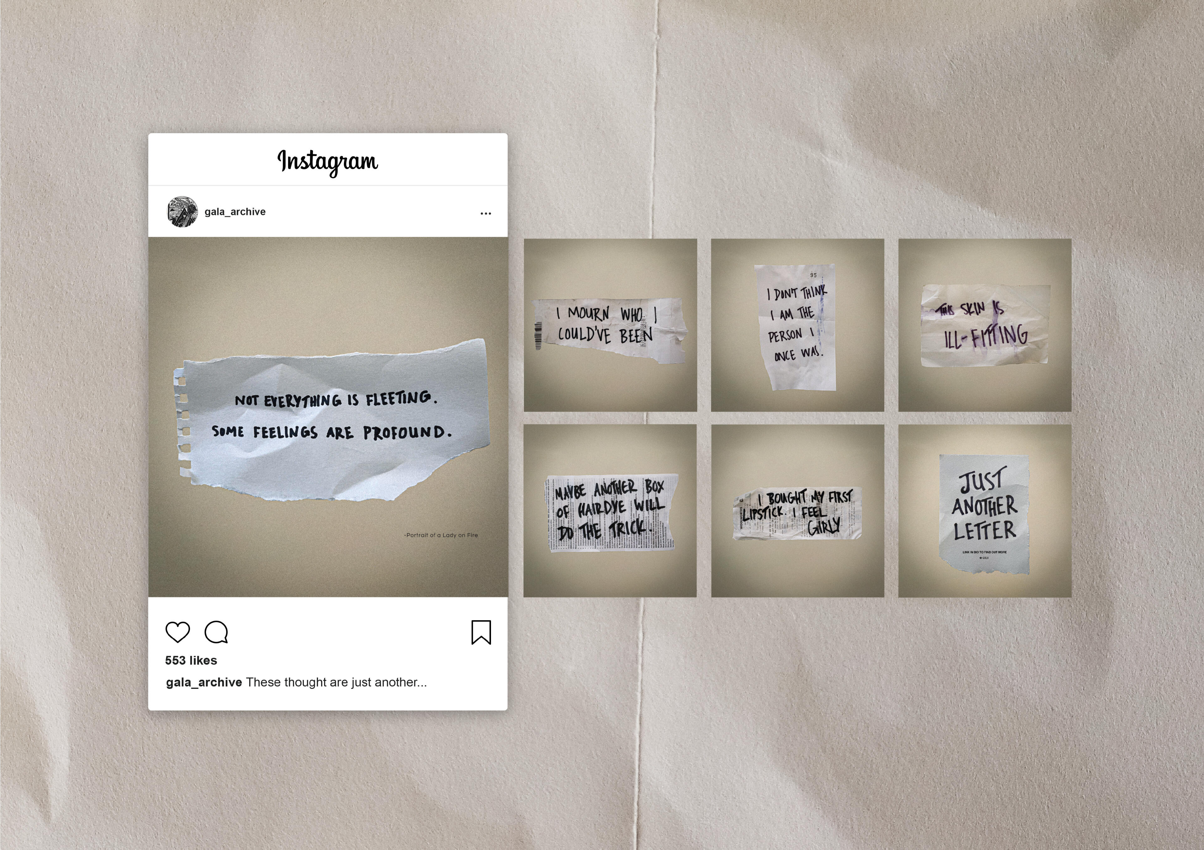
This Instagram carousel brings awareness to the the heavy emotions that are at the core of the queer experience, yet are rarely spoken about. These thoughts are experienced by many queer individuals on a daily basis, and, despite their depressive nature, they have been accepted as just another part of daily life. This casual sentiment is further conveyed by the notes being written on scraps of paper.
Hidden Letters
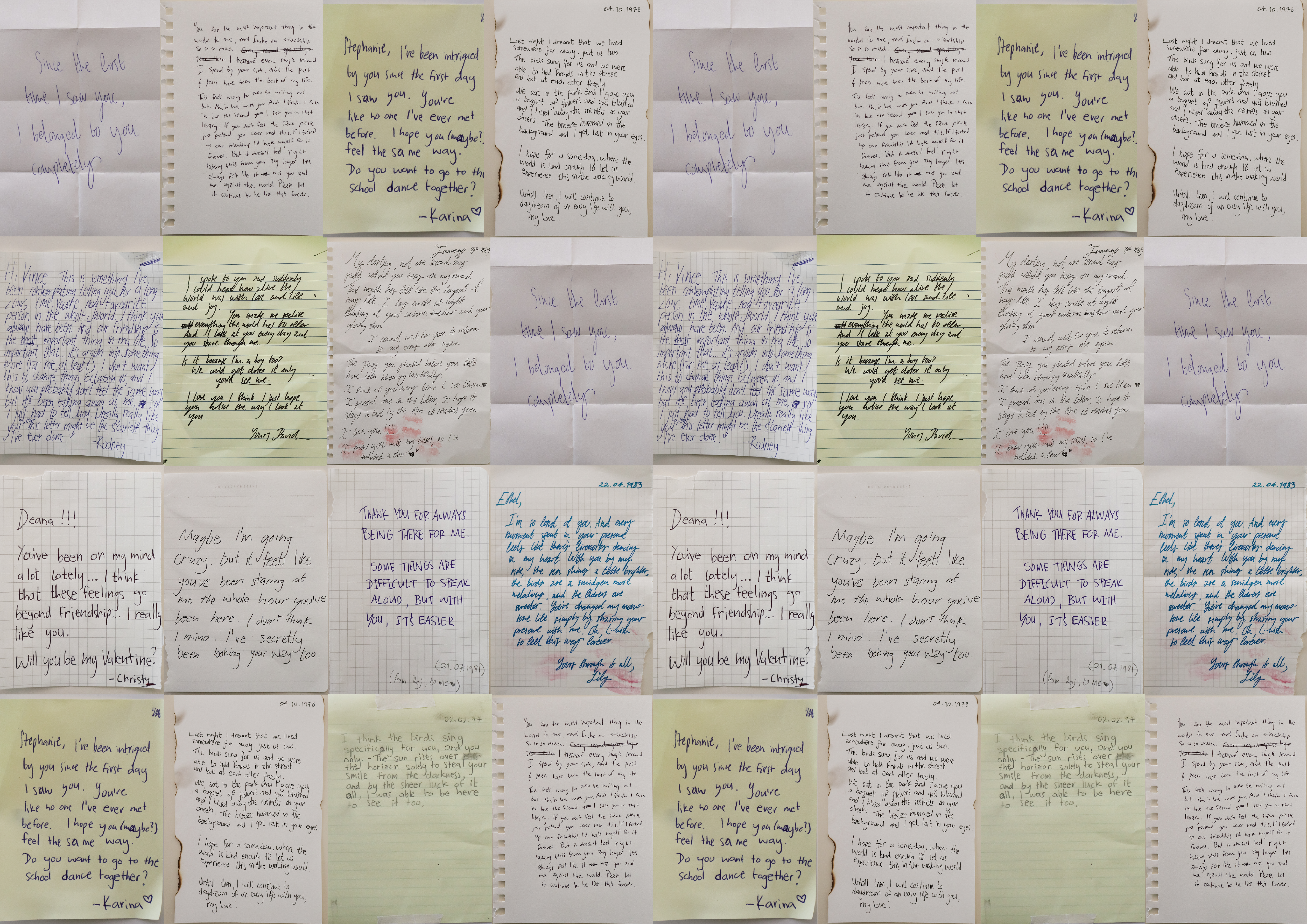
Hidden Letters is a guerrilla marketing scheme in which copies of queer love letters from the past are distributed and tucked away in corners of public spaces. The folded up piece of paper stirs curiosity in whoever happens to come across it, prompting the individual to open it, read its contents, and follow the QR code that leads them to GALA’s official website. These letters are copies of real love letters written by queer individuals throughout decades passed, bringing with them a raw, emotional connection.
The Hero's Voyage
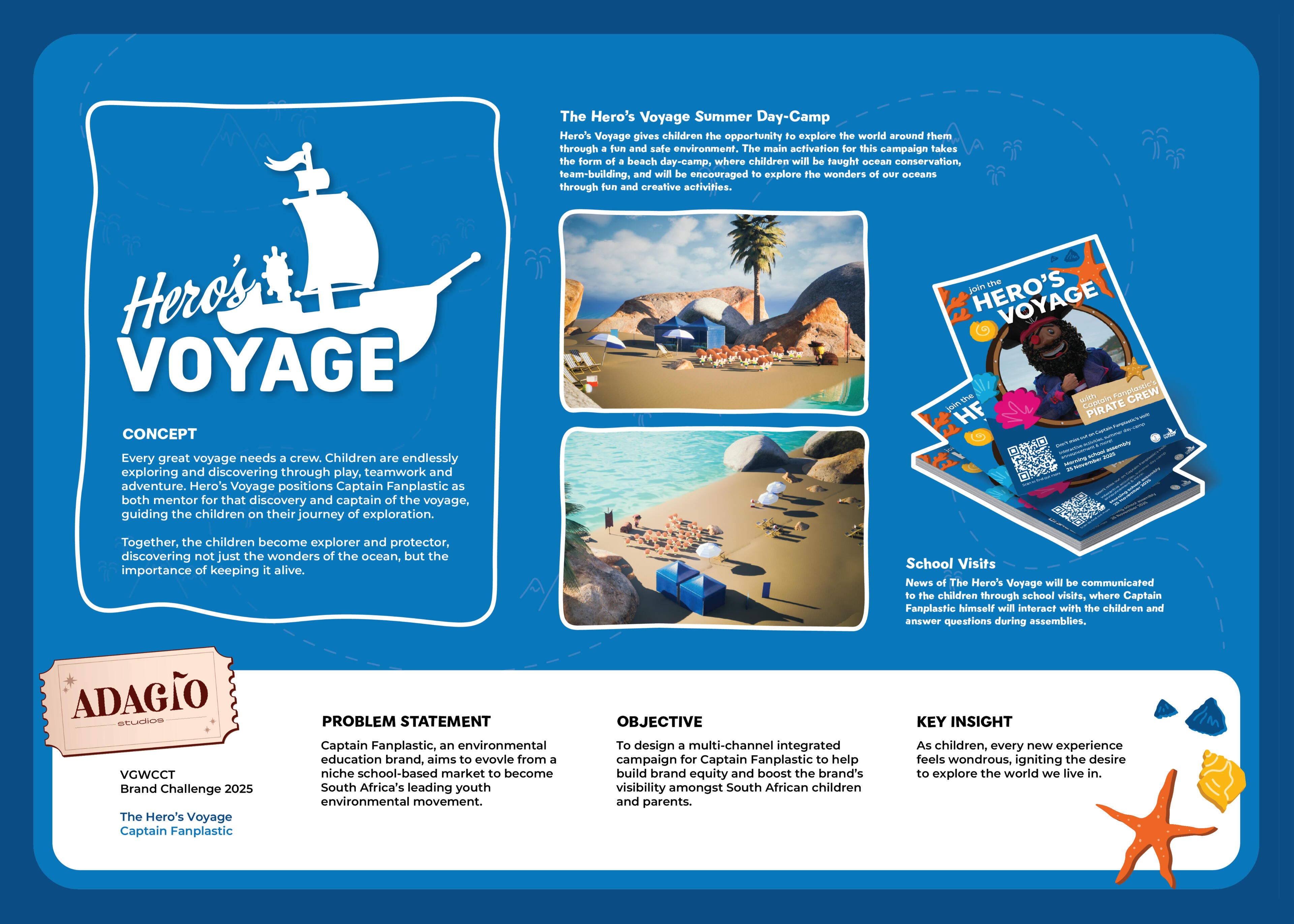
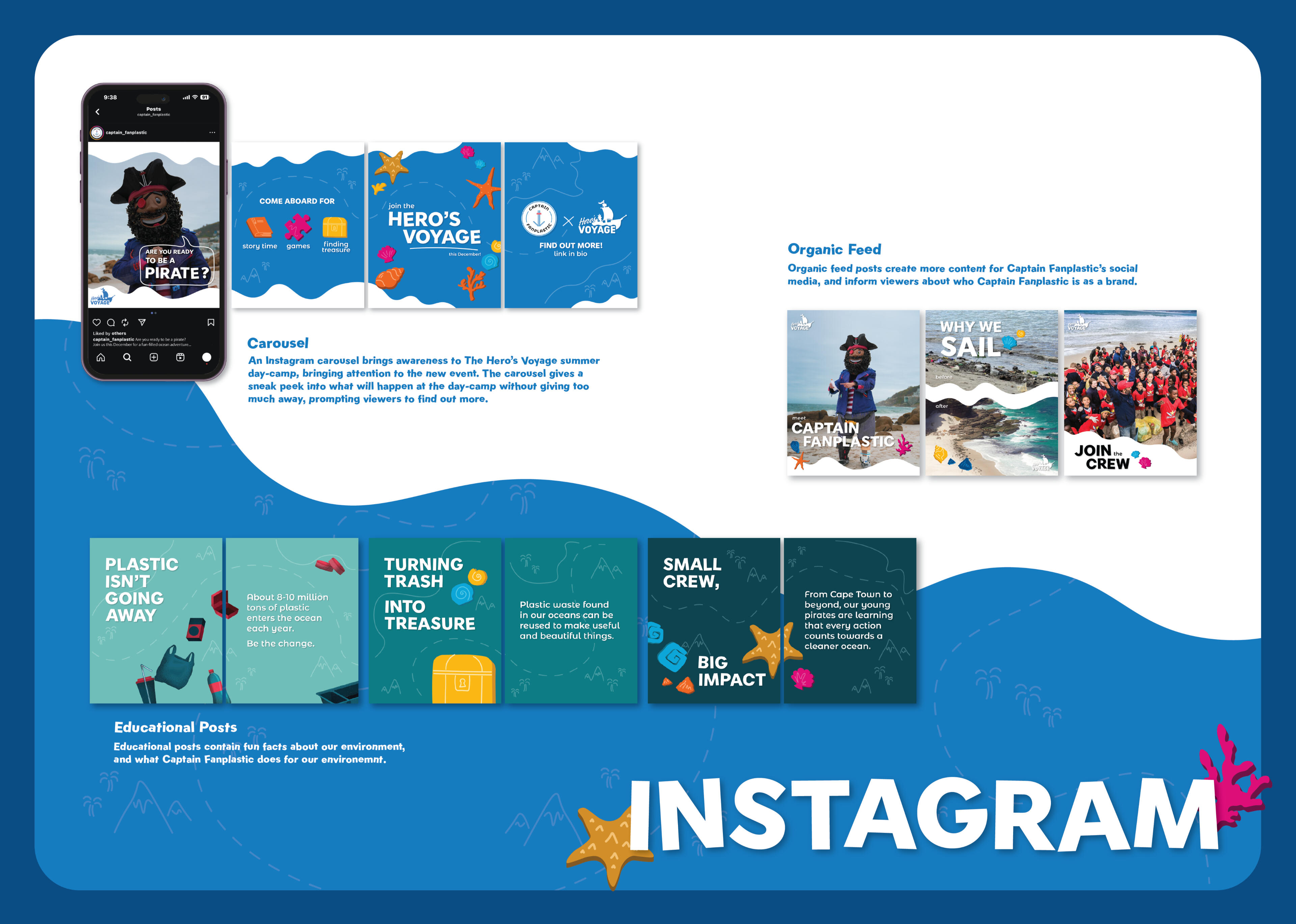
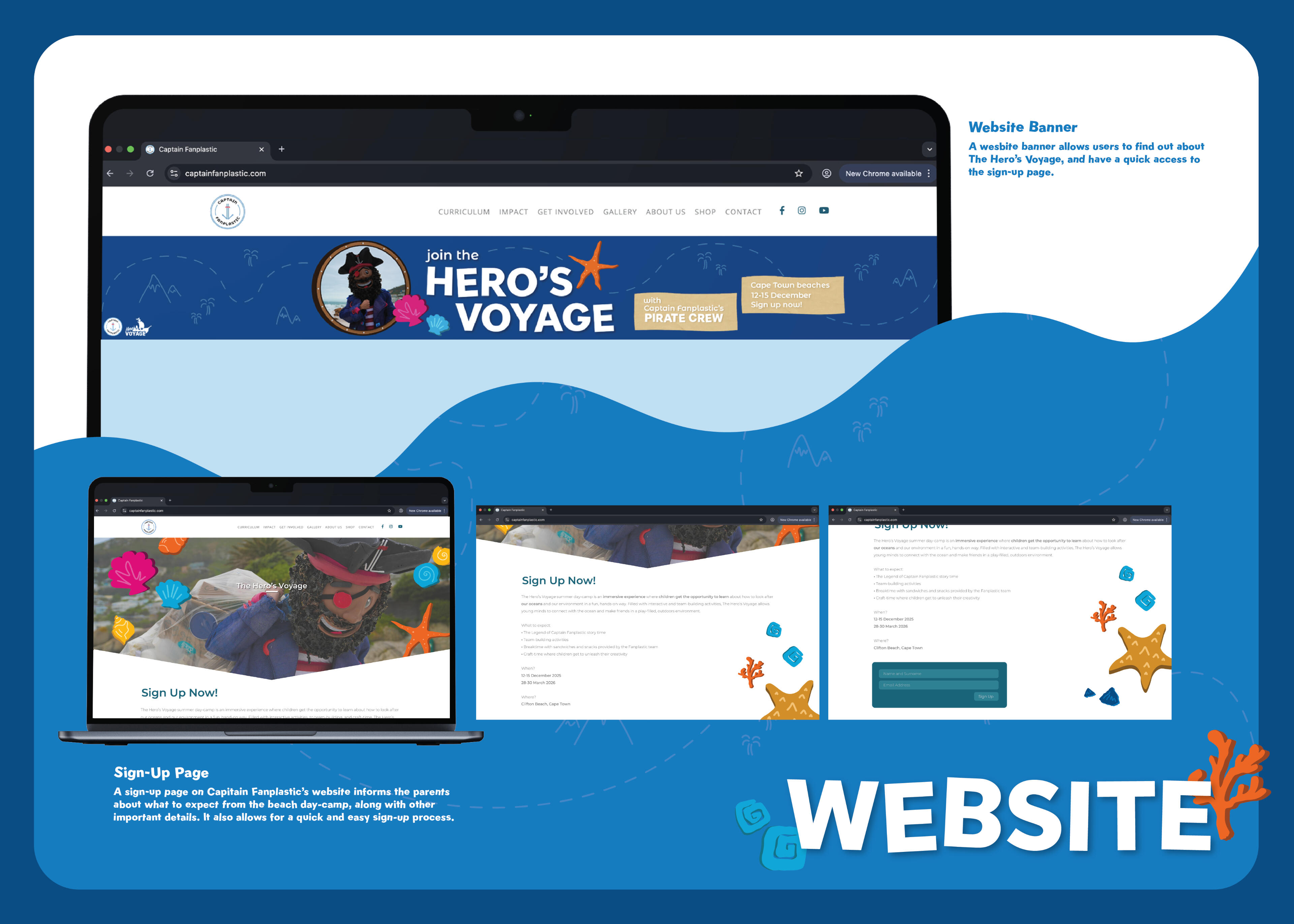
The Hero's Voyage is a project designed in collaboration with digital marketers, strategists, communication designers, and motion designers for the 2025 Vega School Brand Challenge.Our team, ADAGIO Studios, created an integrated campaign for the world renowned ocean education and conservation not-for-profit organisation, Captain Fanplastic.
Interested in meeting the team?
Adagio Studios
ADAGIO Studios is a team of digital marketers, strategists, communication designers, and motion designers who worked together for the 2025 Vega School Brand Challenge.The world is our stage—Adagio puts on the performance of a lifetime, every time.
This is ADAGIO Studio's brand identity and introduction, designed by VISIBABA.